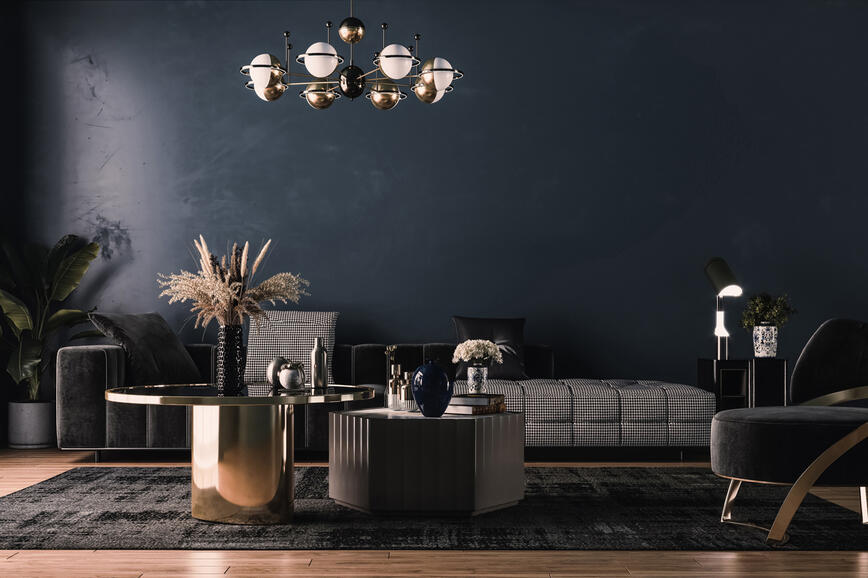
Colorful and unusual - POP ART!
Pop Art is an art movement that emerged in the mid-1950s in the UK and the late 1950s in the United States. It was challenging traditional fine art by incorporating images from popular cultures such as advertising, news, etc. Pop Art is provocative and daring, strong and colorful interior style, with Marilyn Monroe posters, dazzling colors and an abundance of decor.
Shade W11-1 according to HGMIX color chart.

This style is scandalous and energetic; it does not follow any rules and strikes us with its individuality. It is the right choice for bold, mysterious and elegant people, since it offers a wonderful way to combine bold colors and contrasts that escalate across all rooms. It’s an exciting style of interior design that focuses on popular culture; it means bold colors, bright movements and striking signs. It is a trend that wants to be noticed and there are a variety of methods and techniques used by those who want to reproduce the Pop Art theme in their home.
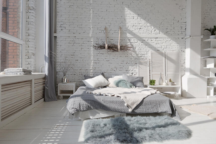
Shade Y01-6 according to HGMIX color chart.

The final touch is added by unusual pieces of furniture that really spice up the ambience. It is an interior design with background, as each item has its own story. We must be careful not to overdo it, as we can quickly achieve the opposite effect and so everything looks very kitschy.
Of all the styles here we can find the most extensive color palette, which is characterized by strong colors.
Principles of decoration
It is often characterized by the use of bright colors and colorful images. The color of the walls varies - from yellow to pink and red, from blue to gray - in fact there are no limits. Two contrasting colors are often combined.
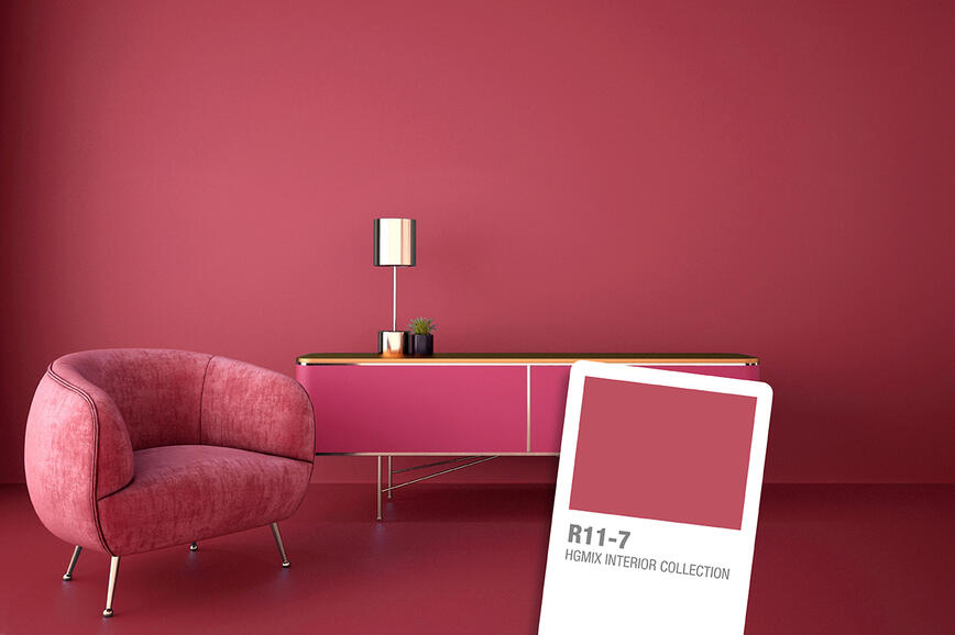
Shade R24-7 and G12-7 according to HGMIX color chart.

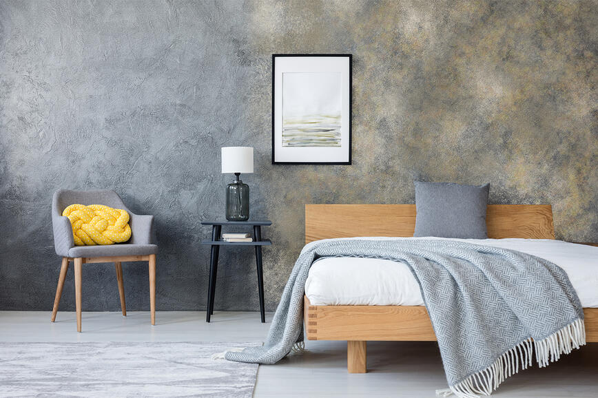
Shade N12-7 according to HGMIX color chart.

The furniture is unique, futuristically made of colorful plastics and with various elements from the 60’s. The interior is bright, sometimes kitschy, bold and innovative. Posters and paintings in the style of works by Andy Warhol and Roy Lichtenstein are an almost indispensable component. The lines of the sofas are semicircular, the bright kitchen counter and the eclectic bed in the bedroom give the interior individuality.
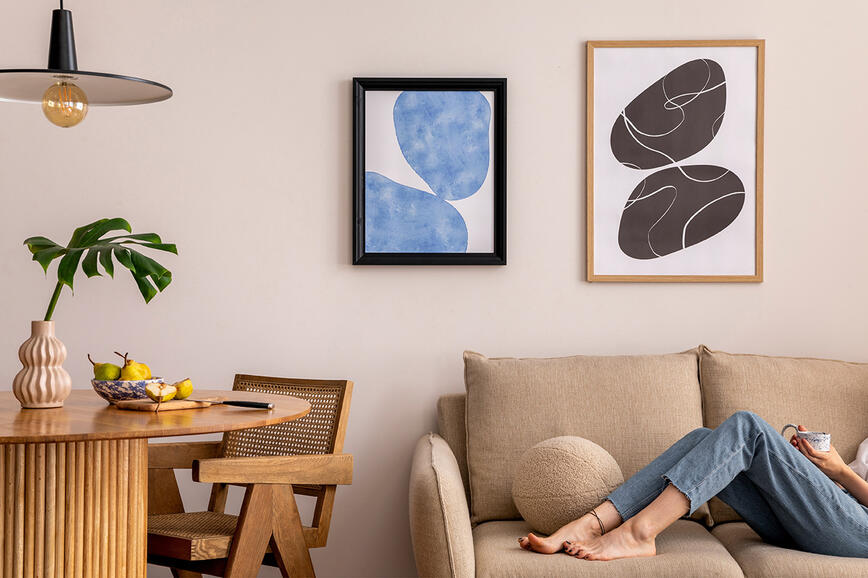
Shade N07-1 according to HGMIX color chart.

“Life in the rainbow” - this could illustrate the brightly colored interior exhibitions made of plastics, synthetic fibers, functional objects of attractive design, repetitive accessories, posters and cheap popular souvenirs. Here are some guidelines to achieve the Pop Art effect:
1. Identical objects of different sizes are placed in different places.
2. In the middle of the room we can place a large photo with a recognizable image of people or products (Che Guevara, Coca-Cola or Marilyn Monroe).
3. The floor is the most neutral part of the composition. We can find bright carpets with the logo of famous companies (or a carpet of a gentle color with a chaotic pattern), wall tiles with repetitive and recognizable patterns.
4. The furniture is bright in color and has an attractive pattern, futuristic and has unusual shapes. We also find glossy surfaces or plastics.
5. The optimal division of the walls according to color is achieved if one wall remains cream or beige, it contains e.g. a mirror of unusual shape or a photograph, and the other walls are in light tones, but we must be careful that they are in harmony.
6. Accessories are made of plastics or chrome, but always in fun shapes - e.g. in the form of female silhouettes or comic book heroes.
This is a style where the color palette is extremely wide. So we have to choose between two contrasting colors, which we calm down with neutral colors and thus achieve the “WOW effect”. HGMIX color chart certainly offers all shades - choose the ones that you like the most.
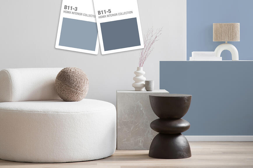
Colour Trends 2026: When Colour Becomes a Thoughtful Tool for Shaping Space
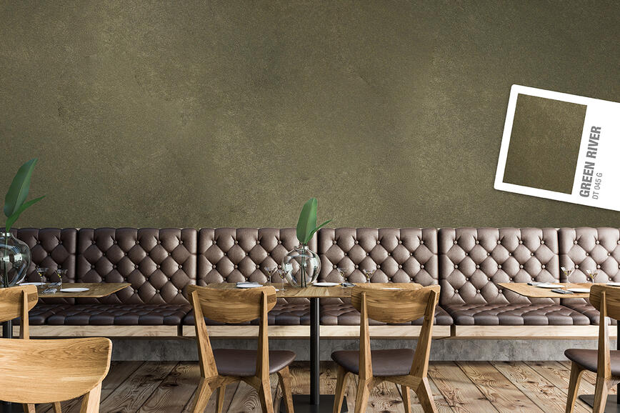
Refined Spaces with Character: Decorative Techniques SPEKTRA Decor Topaz and Quarz for Contemporary Interiors
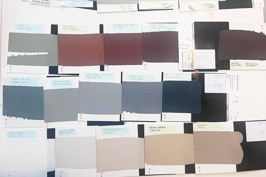
Colours that speak with music: a conversation with architects about the creation of the colour card Music for Your Eyes
Color trends 2025: A sophisticated balance between natural and rich, intense tones
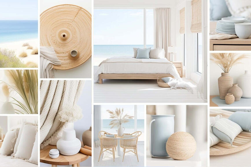
Summer hues in holiday homes
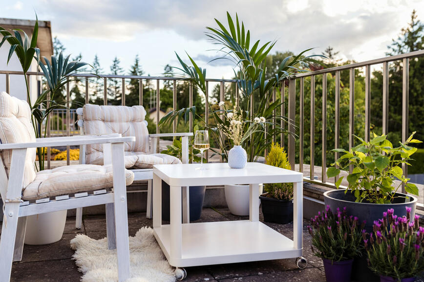
Renovating your balcony or terrace - create a charming outdoor corner for enjoying the nature
How to visually enlarge a small space?
The secret of a beautifully decorated home lies is in the details
Vibrant rose red: bold and optimistic color of the year
How to give your walls a distressed look?
Why is white such a favourite?