Vibrant rose red: bold and optimistic color of the year
This year will be marked by vibrant magenta, a shade of vibrant pinkish red that radiates vivacity, optimism and courage, urging us to enter a new chapter full of optimism, boldness and enthusiasm for new challenges. If last year the blue-purple color opened a new perspective on the field of digital technology and science, and took us to the so-called “metaverse”, where the boundaries between reality and the virtual world are blurred, this year the shade of vibrant magenta will encourage us to experiment, be witty, embrace the unconventional and compassion.

Drawing inspiration from nature
The color of the year, a fearless, elegant and sophisticated vibrant rose red, has deep roots in nature and belongs to the family of red shades. The selection of the color of the year was inspired by the characteristic red color of cochineal, which can only be described with superlatives, as it is considered the most precious and ancient natural dye. The primal connection of color with nature invigorates the human spirit and helps to build inner peace and strength. At the same time, it encourages us to respect nature itself, in all areas of life and work.
The crimson red color represents a perfect balance between warm and cold color tones, and is therefore suitable for all rooms. It goes well with the warm colors of the wooden parquet, as well as the floor in slightly cooler undertones. Experts in the field of color trends describe the shade of pink red as one of the strongest and at the same time the brightest color tones. It is suitable for both smaller and larger and better lit rooms. Feeling bold enough to experiment? Then we invite you to introduce a touch of invigorating and versatile color into the room, which perfectly complements different color tones and has the power to make any home sophisticated and extravagant.


A (too) bold color for the brave
They say that caution is never superfluous, and this is also true when it comes to choosing the colors of the walls, furniture or decor in the home interior. The shade of lively rose-red color is one of the most intense color tones, which require us to think a little more about the placement in the room itself. It is important to consider natural lighting and the size of the room, as well as the influence of colors on our well-being.
Depending on the intensity of the shade, we would advise you to bring the color into the room with decor, or to limit yourself to a part of the wall or a smaller area. Color blocking painting technique represents an excellent solution to the question of how to bring even the most intense, bold and darkest color tones into a room. This is a technique that, with the exception of some creativity, does not require any special knowledge. Masking tape, a brush or roller, a pencil and ruler are enough.
Is a monochromatic look more your style? Then try a combination of red and pink on one wall and create imperfect color finishes that can be achieved with vertical strokes of the roller at different heights. If you decide to take this approach to painting, be careful to apply the paint in small quantities. The less paint on the roller, the easier it will be to create a rough and irregular transition.
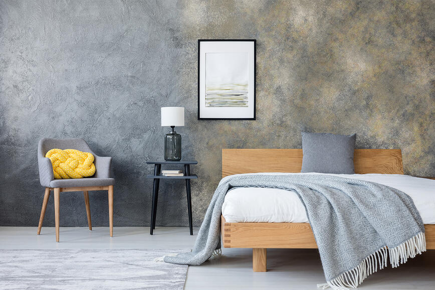
For a smoother transition, you can also experiment with a more sophisticated color gradient effect. Ombre coloring technique dictates a slow transition from a darker to a lighter shade of the same color tone. Paints can be mixed to create different effects, from a very soft and subtle transition, to an impressionistic style with rough brush strokes and strong color contrasts. The advantage of the Ombre technique is that you can completely adapt the final look to your wishes and space, and create a charismatic and unique look.


It should be noted, however, that red color tones have a somewhat special reputation in the world of interior wall colors, as they are considered quite demanding and difficult if we are tired of the color and want to cover it up. An additional layer of paint will most likely be required to cover a stronger red shade, so we recommend choosing a wall color with good covering power, such as SPEKTRA Super or SPEKTRA Extra. Good coverage is also distinguished by white and pastel color tones.
Scratches can also appear on very intensively painted surfaces, or the so-called “"writing effect” if a sharp object is drawn across the surface of the wall. Pigments in glossy coatings are surrounded by a binder, while pigments in matt coatings lie freely on the surface, which will cause them to move to the side in case of scratching and white fillers will become apparent. In order to avoid the “writing effect”, it is recommended to choose glossy coatings for intense color tones, or to protect the coating in matt gloss with SPEKTRA Domflok Matt varnish. This is a transparent coating with a high binder proportion, which covers the pigment and protects the coating against scratching.
Vibrant magenta can also be brought into the home with the help of smaller details
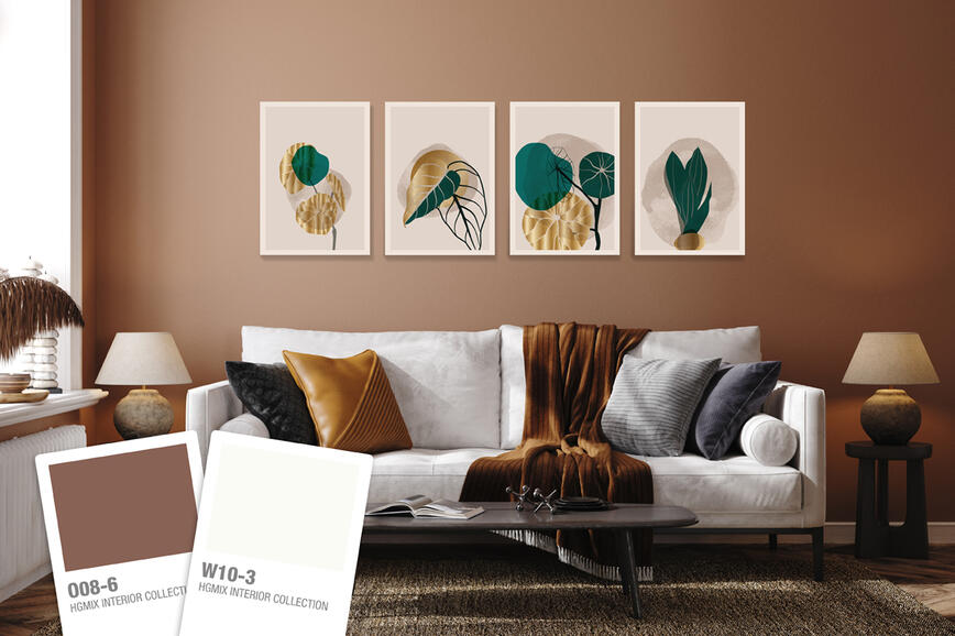
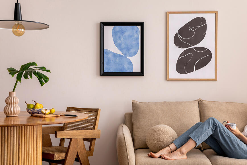
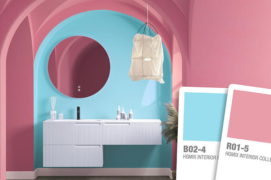
A lush shade of lively pink red color has the power to brighten up any room. If you are not ready to commit to more permanent and bold changes like painting the walls, you can also liven up the space with various accessories and decoration. You can combine it with pale gray, blue, green, pink and even pastel and earth tones. The rosy-red shade goes perfectly with the eternal classic – white and its perfect opposite, the elegant black. You can also add a sense of sophistication and rich glamor to your home with the help of accents on textiles and decorative objects such as curtains, decorative pillows, carpets, stools, vases, flower pots or various works of art.


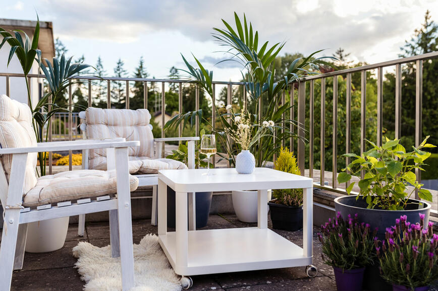
With some creativity, you can also undertake a minor renovation of the existing interior design or garden furniture. We recommend choosing TESSAROL universal covering enamels, which are suitable for both wooden and metal surfaces. Dining chairs, shelves, bed frames, garden furniture, coffee table legs, the lamp above the dining table or counter can be dressed in naughty pink.
Intense color tones can really seem a bit aggressive at first glance, but there is no need to avoid them at all costs. By taking into account the existing color palette of the room, you can enliven any room with the correct combination of colors. If you dare to step out of the existing framework and try something new.

