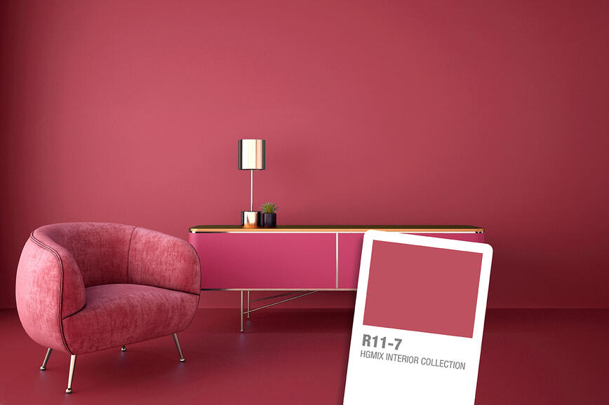
This spring's color palette
2020 was a year of renovations and making improvements to our living spaces. Most of us have been spending an unprecedented amount of time at home and have invested our time and energy in at least one small home improvement project. The desire for and trend of more beautiful and refreshed spaces, where we continue to spend a lot of our time, carry on into spring. We can give it a stylish welcome with the right color combinations.

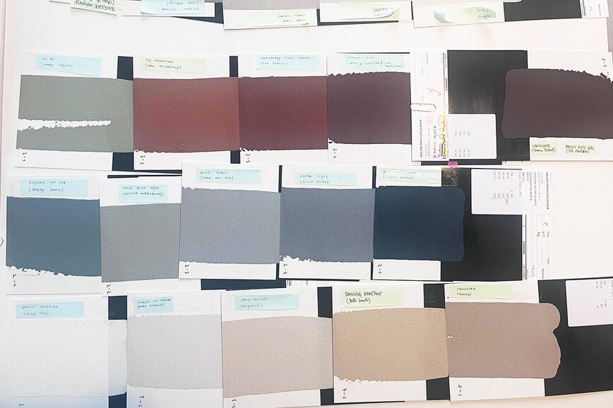
Trends in modern interior colors change rapidly, introducing new combinations and accents into a space and its decorative elements. This spring’s contrasting shades are midnight blue and muted cedar green; combined with pastel shades, they create many playful medleys for interior design. By being bold in using these shades, your rooms will continue to look modern for several years after the renovation.


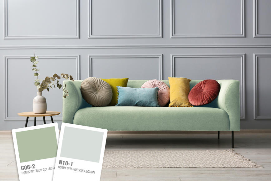
Muted cedar green is soothing, ideal for decorating and creating an inviting, comfortable and beautiful bathroom. It goes extremely well with all shades of white, elegant sand, pastel yellow and warm brown. The details in sand pastels are perfect for highlighting pairings of green and gray, green and white or green and brown.


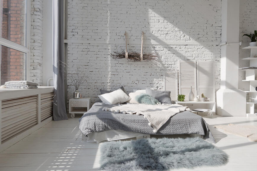
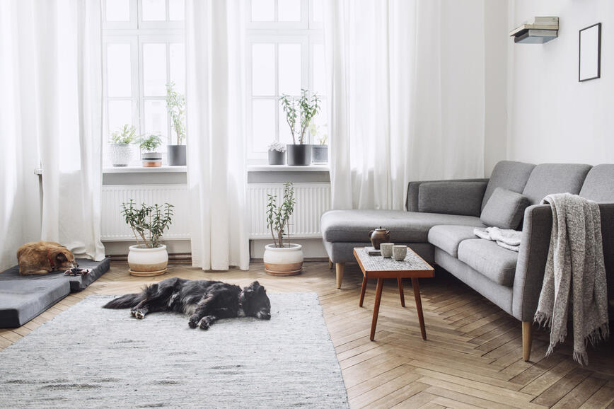
Nature is the best inspiration for creating balanced and harmonious color schemes for interior design. Being surrounded by natural colors will help you feel cozy and comfortable. Our spring color scheme of green, blue and pastel tones is inspired by healing aloe, the deep sea and light wood; the green shades and natural wood pastels create a soothing bedroom and a relaxing and intimate environment. A painted green wall is suitable for all styles of interior design, from more traditional to modern and minimalist solutions. Contrary to popular belief, soothing green is really suitable for use in rooms where we rest.


Calm, earthy neutral tones combined with a soothing green accent will give us the start we all need this year and help rid our home of last year’s stress. A green accent provides this element of freshness, which you will find in our HGMIX color chart under the code G04-5. With its restorative and soothing properties, it creates a feeling of comfort, stability and serenity, while keeping the space pleasant, interesting and attractive. It is an excellent partner for monochrome pastels and for white, black and brown tones. This combination evokes lush vegetation and spectacular natural landscapes. Green is particularly elegant alongside wooden furniture in lighter tones.


This shade of green is ideal for walls; neutral and pastel shades are perfect for furniture and decorations, as the green make them more vibrant and dynamic. Of course, the roles of walls, and decorations and home textiles can be reversed. In this case, go for green bedding and neutral walls in N01-2 and N02-2, or soft pastel W06-4.


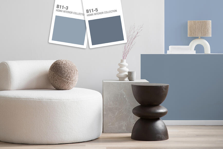
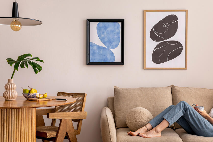
Midnight blue is beautiful, very elegant and wonderful for rooms requiring an elegant and serene feel. Decorative cushions, bedding, upholstered furniture, curtains or carpets in pastel colors will complement and emphasize this elegance. This combination guarantees a relaxing, peaceful and elegant atmosphere in the room. Natural light shades of wood furniture, with the dark blue wall acting as a beautiful backdrop, bring warmth into the room and harmonize the living spaces with each other.


The selected blue B12-7 is deep and spectacular, secretive and inspiring. It represents one of this year’s modern color trends. Dark blue can be combined with misty pastels, white, gray and black to create very calm and tasteful color schemes. Bluish tones are beautiful and versatile; they bring a sense of lightness, soothing coolness and depth to an elegant and comfortable room interior.


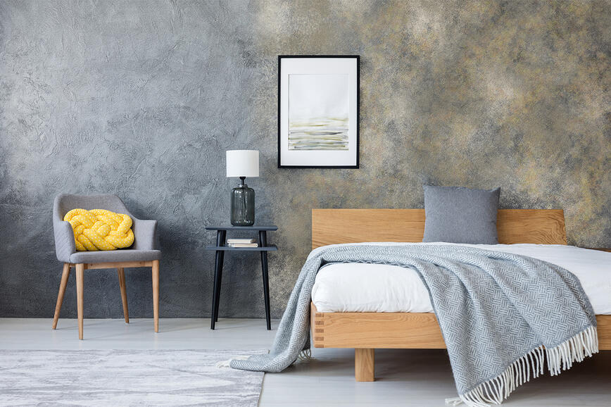
Contrary to popular belief, dark blue is even suitable for painting a wall in a child’s room. We have a tendency to reach for stereotypical colors such as light blue, pink and yellow. A dark blue wall combined with light accessories will add personality to the room, without taking away from the youthfulness and playfulness. If we want to make the children's room more neutral, we choose the neutral shade N02-2 for the colour of the wall.


Sage Green – A Color Trend That Continues to Inspire in 2026
Colour Trends 2026: When Colour Becomes a Thoughtful Tool for Shaping Space
Refined Spaces with Character: Decorative Techniques SPEKTRA Decor Topaz and Quarz for Contemporary Interiors
Colours that speak with music: a conversation with architects about the creation of the colour card Music for Your Eyes
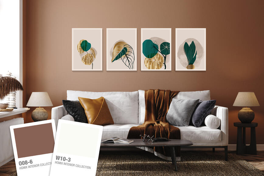
Color trends 2025: A sophisticated balance between natural and rich, intense tones
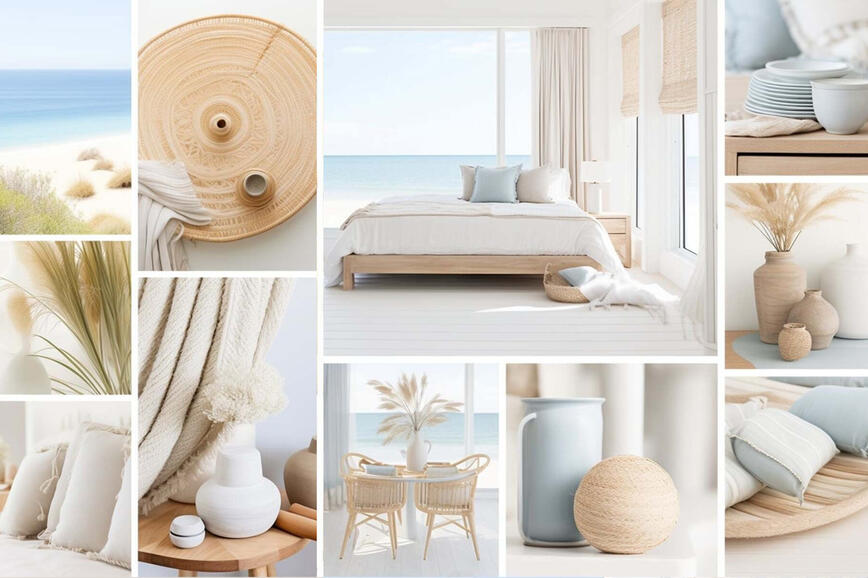
Summer hues in holiday homes
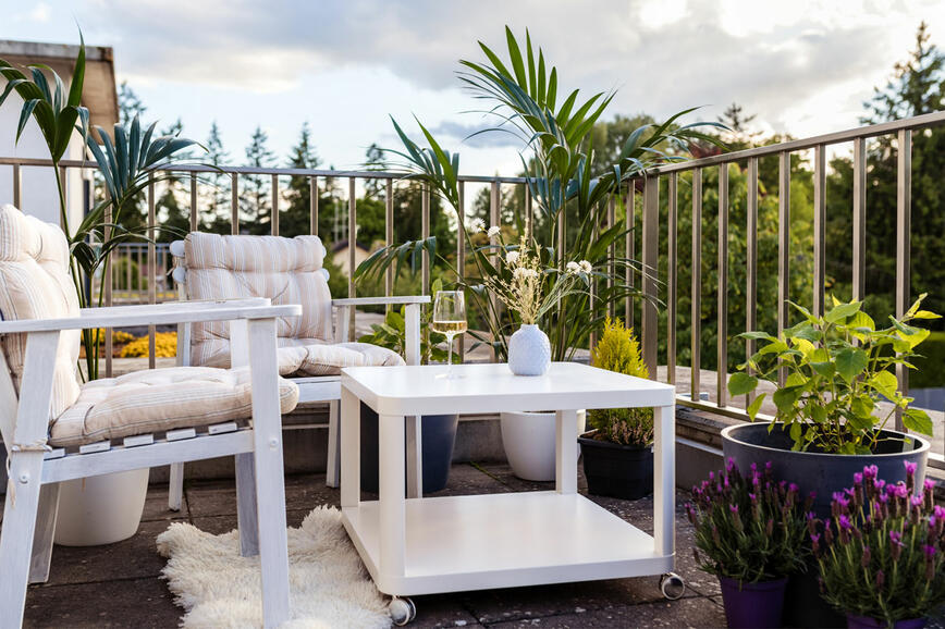
Renovating your balcony or terrace - create a charming outdoor corner for enjoying the nature
How to visually enlarge a small space?
The secret of a beautifully decorated home lies is in the details
Vibrant rose red: bold and optimistic color of the year
How to give your walls a distressed look?