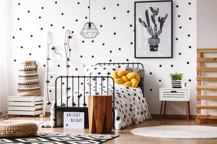
Colour Trends 2026: When Colour Becomes a Thoughtful Tool for Shaping Space
Although bold and expressive colours have been present in modern interiors for some time, many people still remain cautious when choosing wall colours. White, off‑white, and cool grey tones are considered a safe choice, while stronger colours are often avoided — we fear the space might become too dark, closed-in, or visually overwhelming.

Contemporary interior design trends increasingly emphasize not only the importance of colour, but also its thoughtful application. The focus is on colour accents that highlight architectural elements, guide the eye, and add character to the space — without letting the colour to dominate the entire room. One particularly effective approach is colour blocking, which is based on clearly defined colour areas and allows colour to be applied purposefully and in a controlled manner.
Neutral Shades as the Perfect Base for Colour Blocking
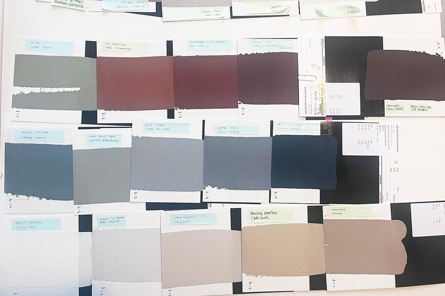
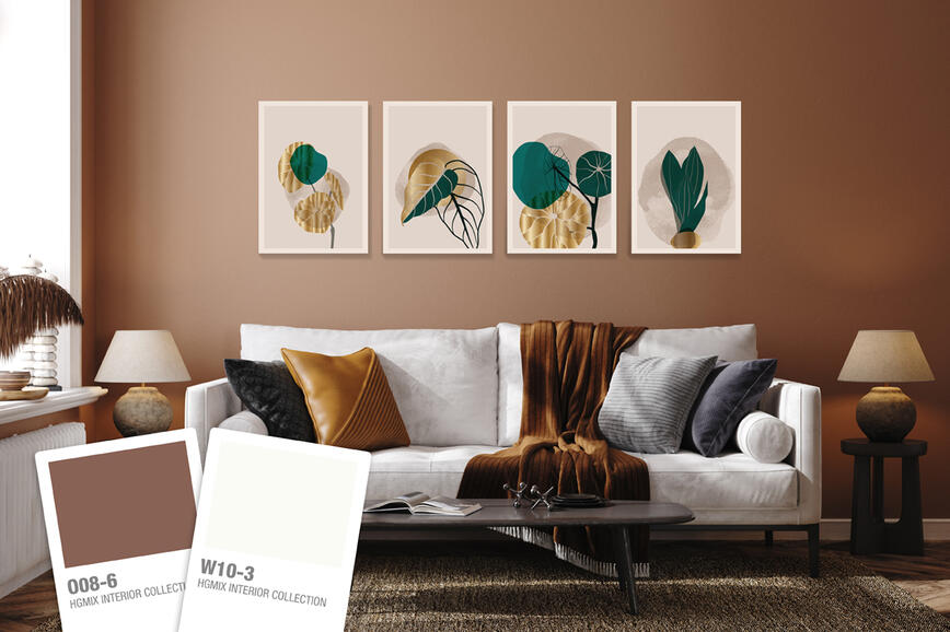
Warm white (W04‑4), sandy beige (N05‑3), “greige” — a blend of grey and beige (N01‑4) — and light stone tones remain the foundation of modern interiors in 2026. On walls, they create a sense of brightness and visual calm while also offering a safe starting point for incorporating stronger colour accents.
On such a base, colour blocking becomes one of the most accessible techniques for using colour. Instead of painting the entire room in a bold shade, colour is applied only to a selected wall or a specific part of it — for example behind the bed, the sofa, or to visually separate a work corner from the rest of the space. It is particularly effective when highlighting architectural features such as irregular walls, columns, or other structural elements.
Practical tip: In colour blocking, the neutral colour should usually cover the larger area, while the stronger tone acts as an accent. This balance allows even deep shades — such as dark blue (B12‑7) or warm reddish‑brown (R19‑7) — to stand out without overwhelming the space. The neutral background softens the accent while allowing it to shine.

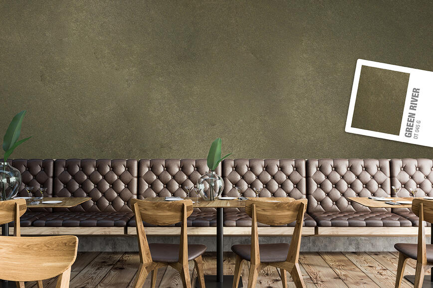
Warm Earthy Accents for a Sense of Home
Earthy tones are key elements in interiors that feel warm, grounded, and connected to nature. Brick red (R19‑6), terracotta (O13‑7), and clay brown (O13‑6) add a sense of stability and create a cozy, welcoming atmosphere.
These shades work beautifully as wall accents on a neutral base, where the colour becomes an integral part of the space, not just a highlight. In colour blocking, earthy tones are especially attractive when used in softer, less strictly defined shapes.
Practical tip: Height placement plays an important role in colour blocking. Darker colours work well lower on the wall, where they create a sense of stability and visual weight near the floor. When used higher up, the room’s visual centre shifts upward, resulting in a more dramatic effect. It’s therefore worth considering the mood you want to create when deciding where to place a colour accent.

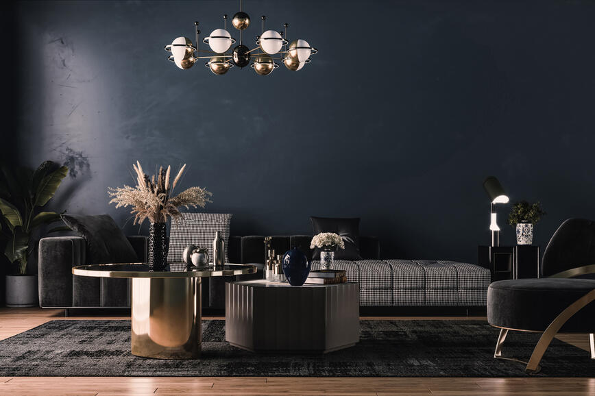
Plum Purple: A Bold Accent with a Defined Edge
Among the standout colour trends, deep, saturated shades are becoming increasingly popular for adding contrast and dimension to interiors. Plum purple (R08-7) is one of those tones that, when used with intention, creates a powerful focal point in any space.
These shades work best on smaller, clearly defined areas. In colour blocking, they can frame a gallery wall or emphasize a specific part of the wall — the colour doesn’t cover the entire area but instead outlines it and directs attention. The limited surface allows the colour to feel intense but not overwhelming.
Practical tip: When working with very dark, bold colours, keep the coloured area smaller with clearly defined edges. Clean lines and geometric shapes ensure that the colour functions as a thoughtful accent without overpowering the room.

Green Tones: Colour in Balance with the Room
Green remains one of the most versatile choices in modern interiors, bringing calmness and a natural feel to spaces. It is expressive enough to add character while still creating a pleasant and livable ambiance.
Popular choices include soft sage tones (Y18‑4), muted blue‑greens (G25‑3), and warm greens (G08‑4). These shades add depth and warmth without feeling heavy or enclosed. Thanks to their calmness, they pair beautifully with neutral tones and natural materials.
Practical tip: A very effective technique is dividing the wall horizontally. A lower colour border creates a more intimate, grounded atmosphere, while a higher one visually opens the space and adds lightness. By adjusting the height of the colour split, you can subtly influence the room’s proportions—without having to paint the entire wall.

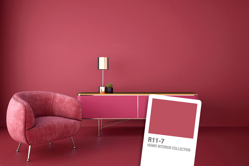
Powder Pink: A Soft Alternative to Classic Neutrals
Soft pinks, such as powder pink (R21‑4), are increasingly becoming a gentle substitute for traditional neutral tones. They offer a middle ground between safe whites and bolder colours — subtle enough not to dominate the room, yet distinctive enough to bring warmth and character.
Practical tip: Powder pink works wonderfully even on larger surfaces, allowing colour to enter the space without feeling overly expressive. It is an excellent choice for interiors where a slightly bolder approach is desired without strong contrasts.

The 2026 colour trends confirm that colours — even the boldest ones — are perfectly suitable for walls. The key question is no longer whether we dare to use them, but how to incorporate them into space thoughtfully.
The principles are simple yet essential: clearly defined colour areas, the right balance between colour and surface, and a good understanding of the space itself. With thoughtful use of colour accents and techniques like colour blocking, colour becomes a controlled and confident design tool — even for those who previously avoided it. Sometimes, just a small colour intervention is enough to make the space behave differently.
Refined Spaces with Character: Decorative Techniques SPEKTRA Decor Topaz and Quarz for Contemporary Interiors
Colours that speak with music: a conversation with architects about the creation of the colour card Music for Your Eyes
Color trends 2025: A sophisticated balance between natural and rich, intense tones
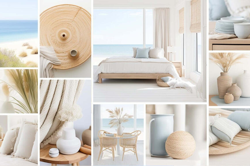
Summer hues in holiday homes
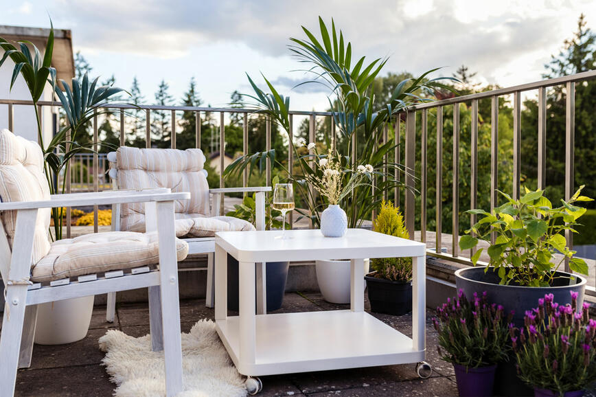
Renovating your balcony or terrace - create a charming outdoor corner for enjoying the nature
How to visually enlarge a small space?
The secret of a beautifully decorated home lies is in the details
Vibrant rose red: bold and optimistic color of the year
How to give your walls a distressed look?
Why is white such a favourite?
Black – the queen of colours