Colours that speak with music: a conversation with architects about the creation of the colour card Music for Your Eyes
Colours and music share a common language – both can speak to us without words. Just as music evokes emotions and awakens memories, colours appeal to our senses and create an atmosphere within a space.

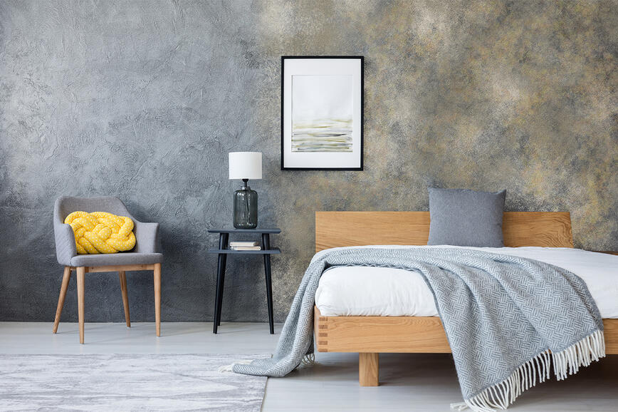
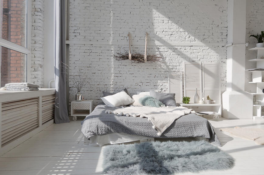
Inspired by iconic songs, the Music for Your Eyes colour collection combines contemporary trends with timeless elegance. Using the decorative techniques SPEKTRA Decor Topaz and SPEKTRA Decor Quarz, it offers a variety of visual effects – from metallic shine to coarse, sandy textures – along with 45 carefully designed shades for spaces with character.
The collection was created in collaboration with the architectural studio GAO Arhitekti, led by Petra Zakrajšek. In a conversation with architects Petra Zakrajšek and Urška Černigoj, who developed the concept and designed the colour palette, we reveal the background of the creative process, the importance of partnership, and their thoughts on the role of colour in modern interiors.
Where did the idea for the new colour card come from? What was the initial inspiration?
Petra: Existing colour cards often offer a wide range of shades, but they lack a unifying story. Our idea was to create a palette with a clear concept – as we like to say, “with a beginning and an end.” We wanted a colour card that interprets natural materials and appeals primarily to architects and interior designers.
For us, colour is much more than just pigment – it represents an experience that enhances the interior we create. When moving from a floor plan to the “character” of a space, colour becomes a key element. And since trends, especially after the COVID period, are increasingly leaning toward a sense of safety, comfort, and connection with nature, it seemed obvious that colours should also originate from these principles.
Urška: We wanted to design a colour card that meets the needs of modern interiors while remaining timeless – not just a response to current trends. The inspiration came from the basic elements of nature: sand, water, earth, terracotta, grass, clay, cloudy skies. From these foundations, we created shades that, like in nature, blend seamlessly without sharp boundaries between seasons.
Petra: Our first conversations started with clay. Not so much the grey tones, but those beige nuances that are the hardest to find in colour cards. With neutral tones, if you start from sand or clay, standard cards often lean too much toward yellow tones, which – speaking from professional experience with light – perform poorly on larger surfaces. Here, even the sandy shades included in the card remain true under light – they don’t shift toward yellow or pink. That was the biggest challenge. These are the colours most missing from cards – light, yet neutral enough not to dominate the entire space.
Although the palette is inspired by nature and earthy tones, we can’t say it’s just a neutral palette.
Petra: Not at all. This palette has incredible energy. It’s a deeper experience of colour, carrying multiple undertones. We combined textures, structures, and decorative techniques so that each colour has its own layers. In this palette, we’re not just talking about pigments – thanks to the specifics of decorative techniques, it’s about the reflection of material in different shades.
Urška: We drew inspiration from everything around us. Our studio is full of materials, so we started with samples – fabrics, stone, ceramics, clay. From these materials came the first test shades, which we then refined and adjusted until we had a complete whole.
Petra: The key difference was that we didn’t start from existing colours but from materials. And we connected these samples with decorative techniques so that the structures are visible in the card itself. In a single colour, there are multiple undertones, multiple dimensions. For me, colour is structure – and decorative techniques beautifully reveal that.


The colour card is named Music for Your Eyes. The shades are named after music hits, including White Wedding, Here Comes the Sun, Cheri Cheri Lady … How did you connect colours with music, and where did the idea to name them after songs come from?
Urška: We didn’t want labels or codes, as is common in colour cards, nor generic names like “Cappuccino”. We wanted something different. That’s where the idea of music and well-known hits came from. Music often evokes certain colours, sometimes even in the song title itself. And after all, music, like colour, is always present in interiors.
Petra: Those were entire days of listening to music – that was the fun part. If you’re a creative person, you let life into your process. It’s not just about colours; it’s about art, films, music, food… all of that is part of us. In our studio, we live what we create.
It seems you mostly chose older songs.
Urška: Maybe subconsciously, but even with music, we were looking for timelessness, just like with colours. That’s why we almost naturally turned to songs that have already stood the test of time.
You mentioned this was your first time creating a colour card. How did the process unfold – from the initial idea to the final product?
Petra: This was our first project of this kind, so we didn’t know the technological background. That’s why it was so important to have a good partner on the other side. The process lasted more than six months; we reviewed an enormous number of samples. The entire studio was covered with colour sheets that we spread out on the floor, compared, and adjusted until we achieved a cohesive whole.
Urška: It was mainly about gradual elimination. First, we wanted to confirm which colours would actually work in interiors. The greatest added value of this card is that all shades were tested on large surfaces. With these techniques, that’s crucial. A client chooses a colour from a small sample, and then suddenly the entire wall is in that shade – and they’re shocked. Some colours looked beautiful on a small sample but simply didn’t work on a larger scale. So, we rejected and refined them until we got what we wanted. Once confirmed, we arranged them by intensity, brightness… so the whole set felt harmonious.
Petra: Basically, we put every colour through a sieve – always on a large format. We considered natural light, artificial lighting, viewing angles… We were relentless because we knew exactly what we wanted. Here, Urška’s perfectionist nature was key – she was meticulous down to the last detail. I think the fact that we didn’t know the technological process actually gave us an advantage. If we had known how hard it was for the team on the other side, we might have been more lenient – and the result probably wouldn’t have been as good.


Do you remember how many rounds of revisions were needed for the most challenging shades?
Urška: For some, we went through as many as twenty rounds of rejections and improvements.
During development, you created more than 500 different samples for a colour card with 45 shades. Was there a shade that stood out as particularly difficult?
Urška: Red. We wanted a brick tone, but at first, it looked completely wrong – we joked it was more suited for a cabaret than an interior. It took quite a few rounds to get the right tone.
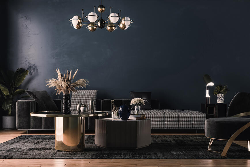
Petra: The greys were even more demanding. Gray can have countless undertones – from green and beige to black and blue. That’s why grey is one of the most complex colours, always a challenge.
What do you think is key to successful collaboration when creating a new colour card as a joint product?
Petra: Above all, a shared vision that comes from good, long-term cooperation. This can only grow from trust and openness on both sides.
In other countries, especially in Italy, you can see how deeply collaboration is woven into the culture. There, it’s the essence of everything – that’s why they’re the best in design. When someone who works with colours, textures, fabrics, furniture… finds a partner who ties it all together – almost like a director – the result is a product of completely different value.
In recent years, we’ve seen a rise in neutral tones, but also more boldness – darker, more intense colours. How do you see this trend in interiors?
Petra: Colour is connected to visual memory, which a person builds from childhood. That’s the emotional part of the story. Interestingly, people have no problem choosing strong colours for a façade, but they’re very reserved in interiors. We think that’s wrong – the façade is part of the surroundings, while the interior is an intimate space. Fortunately, more and more people are starting to see it differently. This colour card aims to encourage people to think about colour more deeply – not as the final touch, but as a feeling, an energy, a light in the space. Decorative techniques are so layered that we can’t even call them just colours – they’re an experience.
Urška: Exactly. When people hear the word “colour”, they often think of bad examples first. It’s easier to make a grey-beige interior than to use colour thoughtfully. But if you introduce it with the right design principles, the space only benefits.
Petra: The most interesting thing is that it’s often architects and designers who fear colour the most. If they could use it more confidently, it would be easier for clients too. Slowly, this is changing – we’re gaining more knowledge, both professionals and clients. But we’re still at the beginning.


When clients come to you – do they come with an idea of a feeling, or with a concrete wish for a specific colour, like a blue-toned living room?
Petra: If I think about it – they never come with feelings, which is interesting because we are the ones who work with feelings. If they explained their emotions and trusted us to translate them into a space, we could achieve a better result more easily. Most often, they come with wishes about details, not the whole picture. We’re here to guide them safely across the water – to explain why something works and why it doesn’t.
Urška: It’s actually a similar filtering process as when creating the colour card. We gather information about the clients, their wishes, and feelings, then filter and shape them into something we’re all happy with.
Wallpaper has been making a comeback lately. How do you see the relationship between wallpaper and decorative techniques? Do you see them as competition or as a complement?
Petra: Absolutely a complement. Wallpaper has a different artistic value than wall finishes. There’s room for both in every interior. Wallpaper is more of an individual choice, while decorative techniques are more widely applicable.
As professionals, you often put your personal preferences aside, focusing on the client’s needs and the character of the space. But if I ask you personally – which colour from the new card would most quickly find a place in your home?
Urška: In my current home – the deep dark blue All Night Long.
Petra: Probably the brick red – the one that was our biggest challenge to perfect: Bed of Roses.
The Music for Your Eyes colour card is the result of months of collaboration, relentless testing, and thoughtful design. It brings together materials, feelings, music, and colours – everything that gives a space its character.
For the user, this means more than an aesthetic choice. With SPEKTRA decorative techniques, they can create a space that truly speaks to them – a space where colour is not just a surface, but an experience. We invite you to explore the Music for Your Eyes colour card and discover how it can speak without words.
Song titles are used solely as a reference for creative inspiration in naming shades. There is no affiliation, collaboration, or endorsement by the authors, performers, or rights holders.
Refined Spaces with Character: Decorative Techniques SPEKTRA Decor Topaz and Quarz for Contemporary Interiors
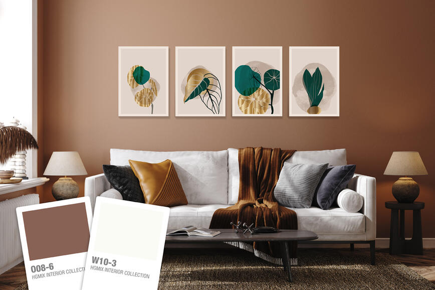
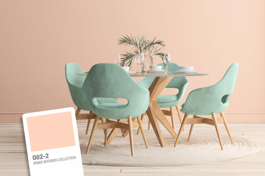
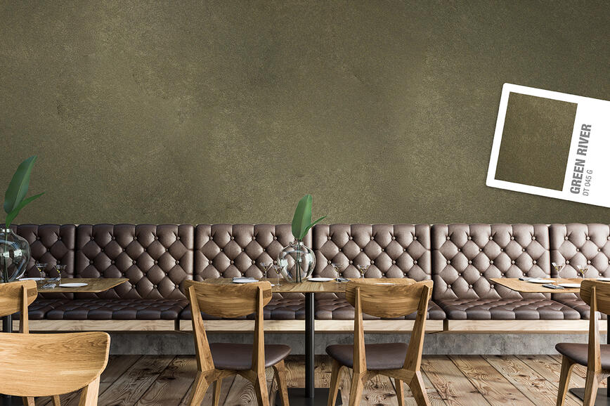
Color trends 2025: A sophisticated balance between natural and rich, intense tones
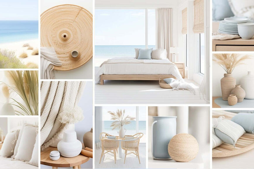
Summer hues in holiday homes
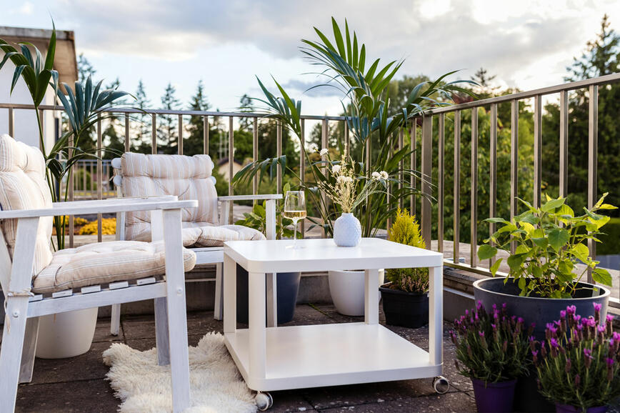
Renovating your balcony or terrace - create a charming outdoor corner for enjoying the nature
How to visually enlarge a small space?
The secret of a beautifully decorated home lies is in the details
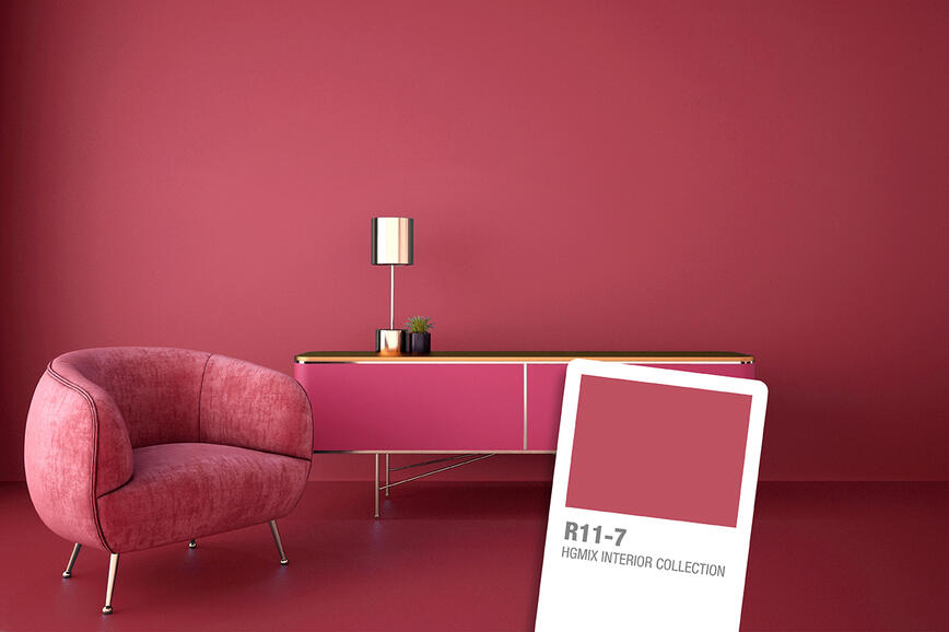
Vibrant rose red: bold and optimistic color of the year
How to give your walls a distressed look?
Why is white such a favourite?
Black – the queen of colours
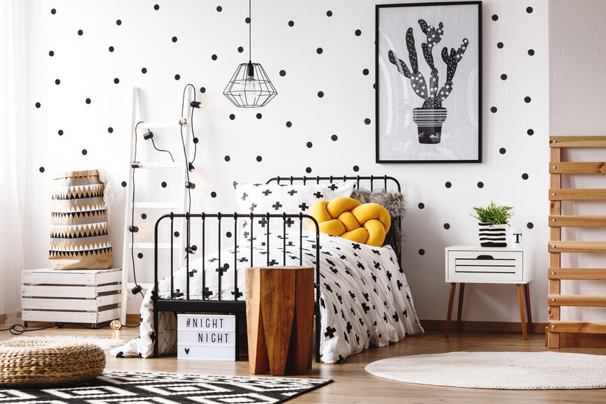
Creative ideas for decorating the children’s room