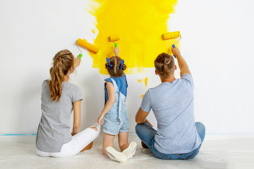
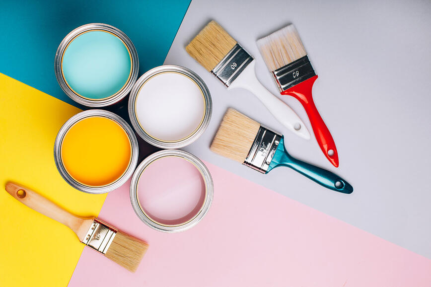
Why is it wise to test paint before buying it?
Choosing the right colour for your walls is one of the most important decisions when renovating your home. Colours not only influence the aesthetics of a space, but also the atmosphere and the feeling of light in a space. Often, the colour on the wall looks different than on the colour chart or in the shop – it can be too dark, too light or have unexpected undertones.

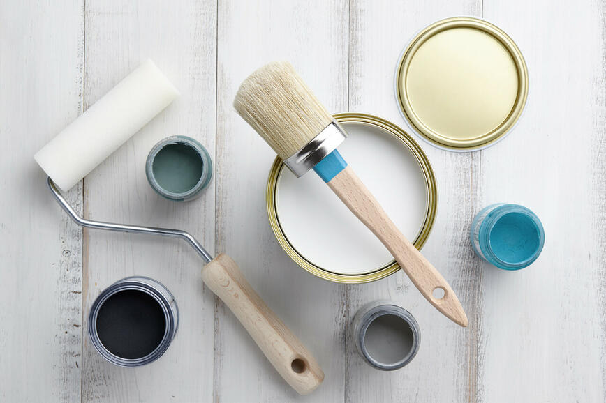
In order to avoid unpleasant surprises, it is a good idea to test the colour on a smaller area before making your final choice. A simple and effective method is to apply the paint to thick paper or cardstock, which you can then move around the room and observe how it changes under different lighting conditions. This will give you a better sense of what the colour will look like at different times of day, and whether it will fit harmoniously with the furniture and other elements in the space.
How light affects the perception of colour in a space
Light has a profound effect on how we perceive colour. Its intensity, direction and warmth can change how we perceive shades, which may make the colour on the wall appear different from the colour chart. The same shade can look cooler, warmer or more saturated in different rooms, depending on the amount and type of lighting.
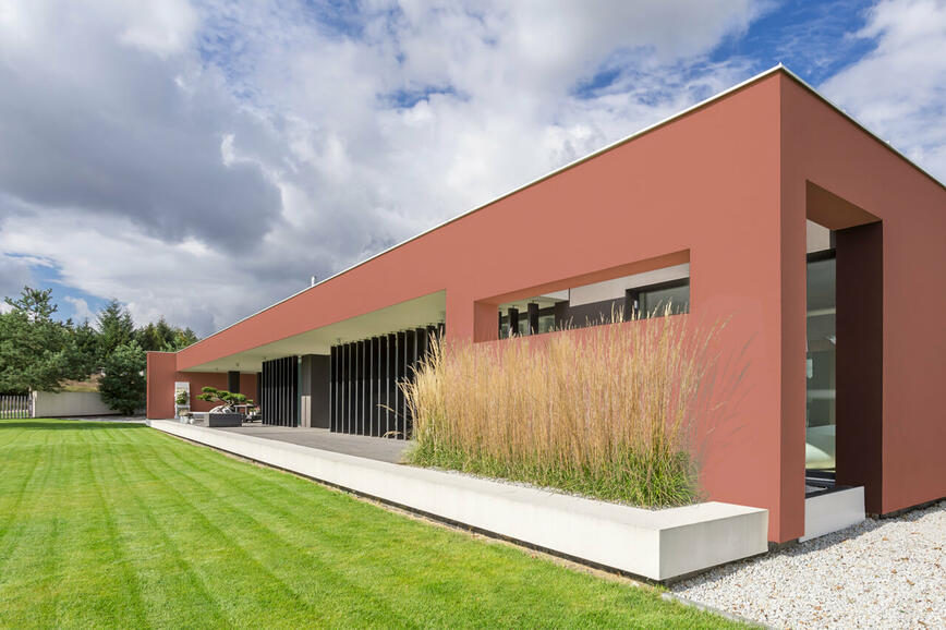
Natural light changes throughout the day, which affects the appearance of the colour. Morning light tends to be cooler and softer, which can emphasise bluish or greyish undertones. In the afternoon, when the light is stronger, colours appear more lively and intense, and some shades appear somewhat yellowish. The orientation of the space also plays an important role - north-facing walls will receive cooler light, while south-facing walls will be lit with warmer tones. In addition, light reflection should also be taken into account – for example, if there is a strong green or red colour reflected from the outside (lawns, brick facades), this can also affect the appearance of the walls in the space.
Artificial light also affects how we perceive colours in the evening. Different light sources emit different warm or cool tones – LED lamps with neutral or cool white light can emphasise cooler undertones, while classic bulbs with warmer light soften the sharpess of blue, grey and green shades. Directed light, such as spotlights or wall ligths, create shadows and highlights that can make the colour appear darker on certain parts of the wall.

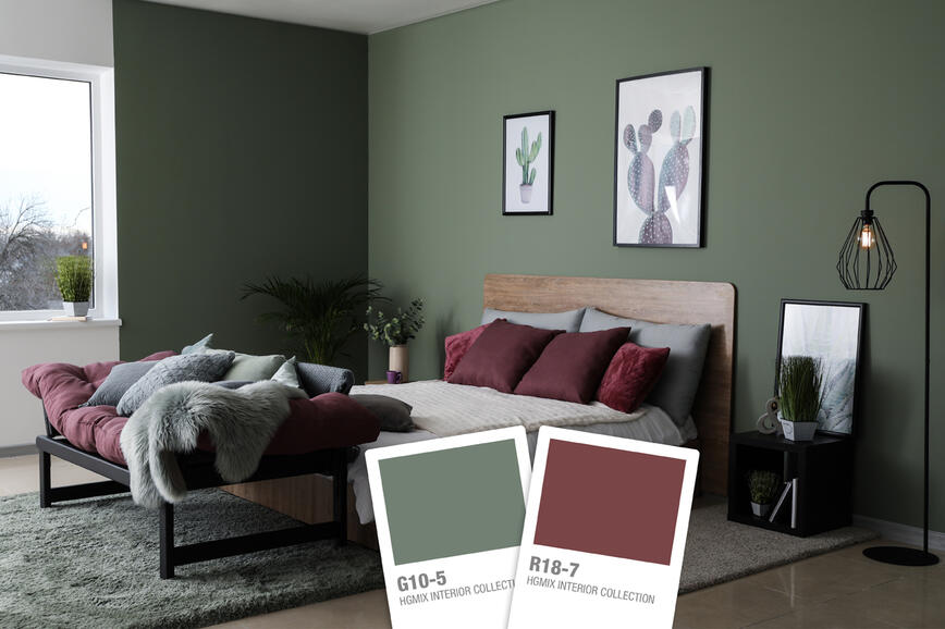
Does the colour you have chosen match your furniture?
The colour shade you have chosen should be in harmony wih existing furniture, floor coverings and other elements in the space. Pay particular attention to combinations with warm wooden surfaces, metal accents and various textiles, as these can subtly affect colour perception.
A cold greyish shade can gain an unexpected bluish tinge with warm wood, and strong contrasts can create a completely different visual effect from what you imagined. In order to avoid unforeseen results, try several shades at the same time and compare them alongside larger pieces of furniture and decor. This will help you choose a colour that blends harmoniously with the interior.

Why is it important to test the paint on a large enough area?
When choosing a colour from the colour chart, it often happens that a shade on a smaller sample looks lighter and less saturated than it will actually look on the wall. Smaller colour samples do not give a realistic perception of colour on a larger surface.
When the same colour is applied to a larger surface, it often appears darker and more intense than expected. A warm beige shade often gains a stronger orange undertone on a larger surface and appears darker. It is therefore recommended to choose a shade from the colour chart that is one level lighter and less saturated than the one you like best at first glance. This is especially important with more distinctive colours such as dark blue, green or terracotta, which can create a stronger effect over a larger area.
💡 Tip: If you are choosing between two shades, the rule of thumb is often that the lighter and less saturated version on the wall will appear more balanced and pleasing in the space.

How to correctly test a colour?
To be as happy as possible with the final result, it is important to test the paint on a large enough surface and in different lighting conditions before making a final choice. The best way is to apply the paint on a movable substrate, like thick paper or cardstock, that can be moved around the room.
✔ Mix the paint thorougly before application and follow the instructions on the packaging. Take into account the recommended number of coats, as the final colour shade may vary depending on the application method.
✔ Wait for the colour to dry completely. The colour may darken slightly during the drying process, so it is important to assess the final appearance only after it has dried completely.
✔ Observe the colour in different lighting conditions and in several places in the space. Morning, afternoon and artificial light can have a big impact on its appearance. Also take into account the reflection of colours from the surroundings, as well as matching existing furniture, flooring and other interior elements.
✔ Test several shades at the same time and compare them with each other. If you are choosing between two shades, the rule of thumb is often that the lighter and less saturated version on the wall will appear more balanced and pleasing in the space.
Keep your colour choice simple, tried and tested and without surprises!
Radiator Renovation: From preparation to finish
Bold colours or soft elegance: How to paint a space with personality
How to effectively block water-soluble stains on wall surfaces
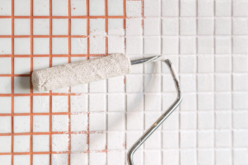
Renovating your bathroom in one step with ceramic tile paint
Painting project: From preparation to cleaning
Renovation of a façade due to the growth of mould and algae
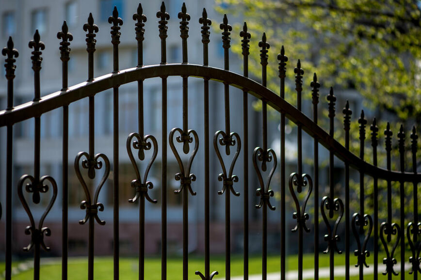
A project for autumn - restoring an outdoor metal fence
How to properly and safely get rid of paint residue?
Choosing a facade paint that does not fade over time
Facade choice - differences in thermal insulation
Façade energy renovation