Tavaszidéző pasztellszínek az otthonbában
Hosszú ideig az volt a széles körben elterjedt vélekedés, hogy a pasztellszínek csak a gyerekszobában használhatók. Szerencsére ez a gondolkozásmód megváltozott. A pasztellszínek hatalmas lépést tettek a modern, kortárs belső terekbe, ahol végtelen lehetőséget kínálnak.

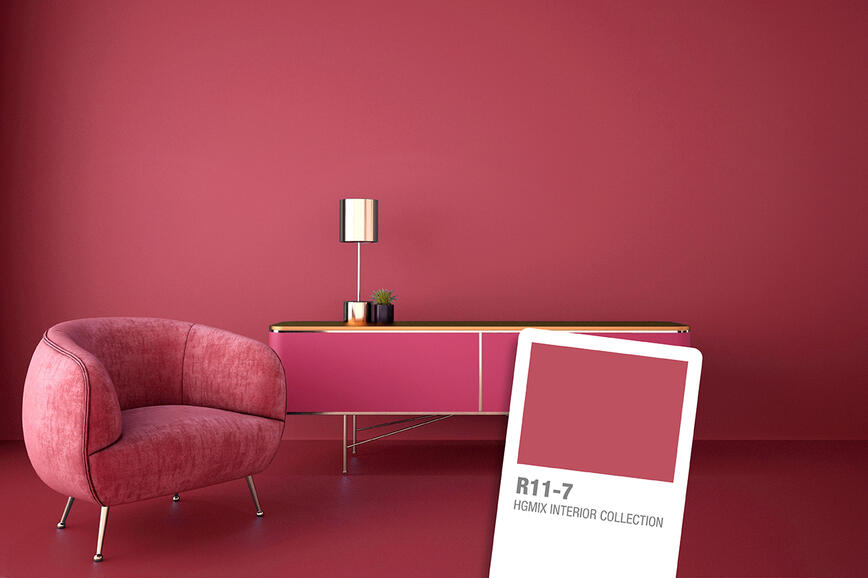
A pasztellszínek nem tartoznak egyetlen színcsoporthoz sem, hanem olyan árnyalatok, melyeket fehér hozzáadásával állíthatunk elő egy adott színből; például ha fehéret adunk a kékhez, mely egy elsődleges szín, világoskéket kapunk. Ennek eredményeképpen a pasztellszínek sokfélék, és új dimenziókat adnak azokhoz a színekhez, melyekből létrehozták őket. A piros például hagyományosan energiát vagy veszélyt jelképez, a pasztellrózsaszín – melyet fehér bekeverésével kaphatunk a pirosból – viszont lágy és gyengéd.
Sok pasztellszín a nyugalom és csend, valamint frissesség érzetét adja, ezért nagyon alkalmasak a lakberendezésben, akár falakra, akár bútorokra vagy kiegészítőkre. Ezenkívül sokoldalúak is; egyfelől megadhatják egy tér karakterét, másfelől pedig kellemes egyensúlyt hozhatnak létre.
Mindenfajta térhez alkalmasak
A világos pasztellszínek elegánsak, gyengédek és nem tolakodók, és ezért a lakás minden helyiségében használhatók. Míg az intenzív, erős színek miatt egy helyiség kisebbnek tűnhet, a pasztell árnyalatok éppen ellenkezőleg, felnyitják a teret. Ezért nem lehet hibázni, ha pasztell árnyalatokkal fest, akár az összes falat, akár egy falat vagy csak egy mintát fest.
Azonban a festés elkezdése előtt mindenképpen érdemes a teljes képet figyelembe venni. Mielőtt belemártaná a hengert a kedvenc festékébe, gondolja végig, milyen bútorok vannak az adott helyiségben. Ha a bútorokat, a kanapét, székeket, asztalt, ágyat vagy ruhásszekrényt megtartja, gondolja át, hogy milyen szín illene mindegyikhez. Lehet, hogy a pasztellrózsaszín a kedvenc színe, de előfordulhat, hogy nem a legjobb választás, ha nem illik a berendezéshez.
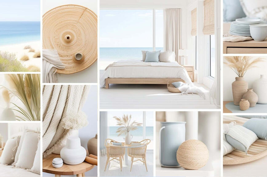
A legnépszerűbb pasztell árnyalatok
A legnépszerűbb pasztell árnyalat a világos rózsaszín, világoskék, levendulaszín és a világoszöld. Sok további szín is elérhető a HGMIX Colour Collection színkártyákon. Ha most használ először pasztell árnyalatot, a világoszöld biztonságos választás. Friss és lágy, és különösen jól működik olyan helyiségekben, ahol kevesebb a természetes fény. Jól illik a természetes, földszínű tónusokhoz, fából készült elemekhez, valamint a feketéhez, mely gyengéd pasztellszínekkel kombinálva drámai kontrasztot képez.


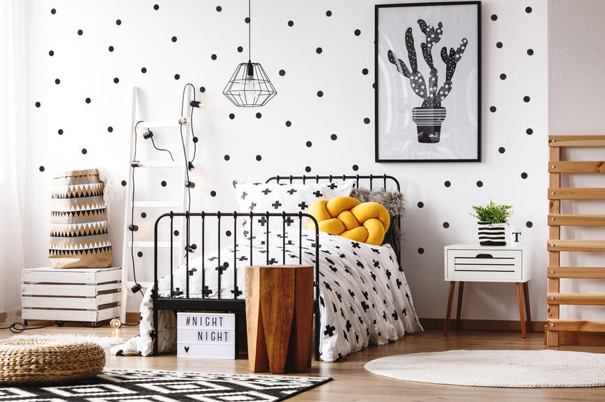
Egy másik olyan szín, mely valamikor nagyon népszerű volt a gyerekszobákban a lágy rózsaszín; végül megtalálta a helyét a modern lakberendezésben is. Ha modern bútorokkal kombinálják, sikkes és minimalista, és jól illik a feketéhez és a sárgához.


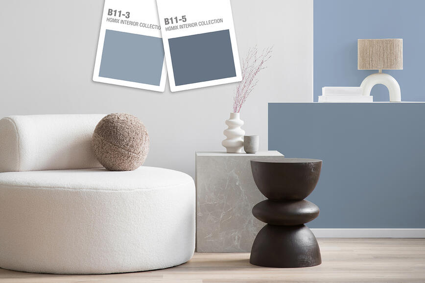
A világoskék klasszikus szín, melyet biztonságos és nyilvánvaló választásnak tekintenek mind a nappaliban, mind a konyhában. Többféle beltéri formatervezési stílust kombinál, és egy modern, de az 1920-as évekre is utaló stílushoz ugyanúgy megy, mint egy más, rusztikusabb stílushoz. Kitűnő választás a konyhába fehér vagy színes összetevőkkel, a helyiségnek élettel teli rezgést adva.


A levendula megnyugtató, ellazító színe tökéletes a hálószobába, és tetszés szerinti bútorokkal kombinálva modern, kifinomult, rendkívül kényelmes megjelenést ad. Nagyon jól hat egyéb helyiségekben is.


Lépésről lépésre
Ha a fehér falakhoz van szokva, az áttérés a pasztellszínekre, bár nem ejti rabul a tekintetet, mégis nagy lépés lehet. Kezdheti azzal, hogy egy szobában egy falat vagy a fal egy részét festi le, és fokozatosan viszi be a színt a helyiségbe. Ennek az az egyik előnye, hogy lehetővé teszi az előző festésekből megmaradt festék felhasználását. Ha esetleg maradt egy kis fehér festék a garázs sarkában, ezt színezve elkészítheti saját pasztell árnyalatát.


Pasztellszínek a bútorokon
Ha nem szeretné a falakat lefesteni, felújíthatja a bútorokat, és így alakíthatja át a helyiséget, egy kis színt becsempészve. Egy szép pasztellszín feldobhatja a konyhai szekrényeket, új megjelenést adva a helyiségnek, vagy lefestheti az étkezőben a székek lábát, egy tálalószekrényt a sarokban, egy íróasztalt... Az ötletek és lehetőségek száma végtelen, ha szabadjára engedi a képzeletét.


A festék lehető legjobb felhordásához
A jó előkészítés segít a lehető legjobb eredményt elérni a festett felületeken. A festés során kerülje a huzatot és a nagyon magas hőmérsékletet, hogy a festék ne száradjon meg túl gyorsan; tartsa be a csomagoláson feltüntetett hígítást; végül pedig a megfelelő hengert használja.
A habból készült hengerek nem alkalmasak a beltéri falak festésére (túl vékonyan viszik fel a festéket), ezért használjon hengereket különböző hosszúságú rostokkal. Amikor faanyagból készült bútorokat fest, vízbázisú festékekhez normál hengert használjon, oldószeres festékekhez pedig filchengert. Használat előtt a hengert nedvesítse be, majd nyomja ki, és a faanyagon végiggörgetve nyomja ki belőle a vizet, és nyissa fel a rostokat, mivel így jobban fel lehet hordani a festéket.
Sötétből világos
Ha a falat sötétre festette, és most pasztellszínnel szeretné átfesteni, használjon normál falfestéket a kiválasztott árnyalatban, és két rétegben vigye fel: SPEKTRA Classic Plus, SPEKTRA Extra, SPEKTRA Super, SPEKTRA Fresh&Easy vagy SPEKTRA Perfect White.
Ha nagy igénybevételnek kitett falfelületet fest, használjon SPEKTRA Latex Matt vagy Semi-matt diszperziós festéket. Először azonban a SPEKTRA Extra beltéri falfestéket kell felvinni a jó fedőképesség biztosításához, mivel a SPEKTRA Latex Semi-matt nagyon vékony színes bevonatot képez. És már kezdődhet is a móka!
Színes trendek 2026-ban: amikor a szín átgondolt eszköz lesz a tér alakításához
Kifinomult terek karakterrel: a SPEKTRA Decor Topaz és Quarz díszítőtechnika modern belső terekhez
2025-ös trendek a színek világában: kifinomult egyensúly a természetes és a gazdag, intenzív tónusok között
Nyári árnyalatok a nyaralókban
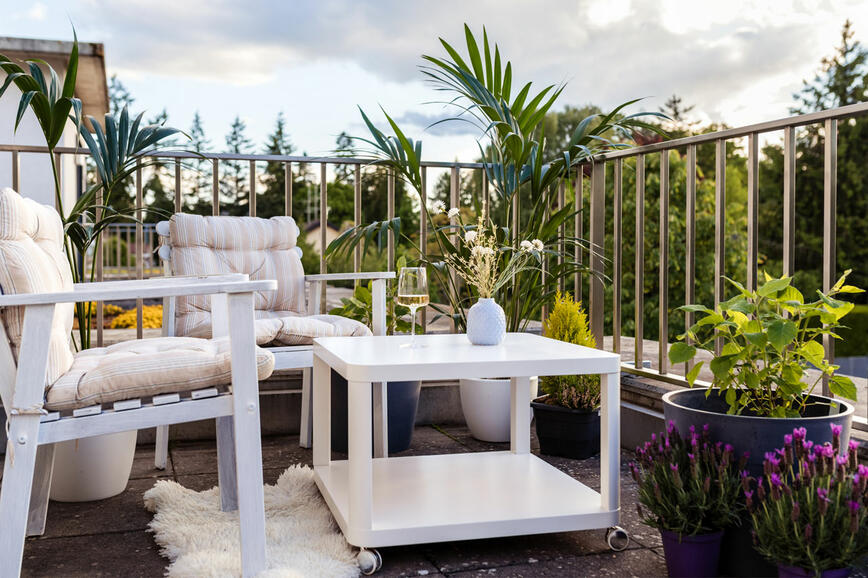
Az erkély vagy terasz felújítása – hozzon létre egy elbűvölő kültéri sarkot, ahol élvezheti a természetet
Hogyan lehet egy kis helyiséget vizuálisan megnövelni?
Egy gyönyörűen díszített lakás titka a részletekben van
Ragyogó rózsavörös: az év merész, optimista színe
Hogyan adjon a falainak kopott megjelenést
Miért ekkora kedvenc a fehér?
Fekete: a színek királynője