Tinte estive nelle case vacanze
L’estate: vale a dire, il periodo dell'anno in cui le persone vanno in vacanza in massa per prendersi una pausa dallo stress della vita quotidiana e godersi un'atmosfera rilassante. Che siano al mare, in montagna o in campagna, le case vacanze diventano i nostri rifugi temporanei, dove è possibile sfuggire alla frenetica vita di città e connetterci con la natura. Per vivere al meglio l'attesa stagione delle vacanze, è importante che anche gli interni delle nostre case riflettano la leggerezza e la freschezza estiva.

Per l’arredamento d’interni, un aspetto fondamentale è la scelta delle combinazioni di colori affinché si crei un ambiente piacevole e armonioso. L'uso di tonalità estive può infondere freschezza e leggerezza in uno spazio, ma è comunque importante considerare le giuste proporzioni nella scelta dei colori, per ottenere un effetto armonioso. Quando si scelgono le combinazioni di colori nell'arredamento d'interni, è consigliabile seguire la regola del 60-30-10. Il 60% dello spazio dovrebbe essere occupato dal colore principale, il 30% da tonalità neutre e il 10% da colori d'accento.
Il colore principale è quello che domina lo spazio, ovvero quello più comune delle pareti e di altre superfici più grandi, come i pavimenti e i mobili di grandi dimensioni. Il colore secondario è complementare a quello principale e viene utilizzato per le superfici di medie dimensioni come i mobili di dimensioni più piccole, le tende e i tappeti. il rimanente 10 percento è composto da tinte vivaci che offrono vitalità e audacità allo spazio Sono utilizzati su superfici più piccole come cuscini decorativi, opere d'arte, vasi e altri elementi di decorazione.


Quando si inizia a progettare un interno, la prima cosa da fare è raccogliere tutte le idee e i desideri e creare una cosiddetta "tavola di stile”. Scegli colori, materiali, texture e uno stile che ti stia a cuore e che si adatti bene al tuo stile di vita. In questo caso è ragionevole porsi le seguenti domande quando si progetta uno spazio:
- dove trovare lo spazio? Al mare, in montagna, in campagna o forse altrove?
- Lo spazio è naturalmente luminoso? Deve essere ambiente caldo o fresco?
- Quale stile ti sta a cuore e riflette la tua personalità?
Una preparazione anticipata agevola l'intero processo e garantisce che l'aspetto finale sia armonioso e si sposi con l'ambiente della tua casa vacanze.
Toni neutri per conferire calma e calore naturale.
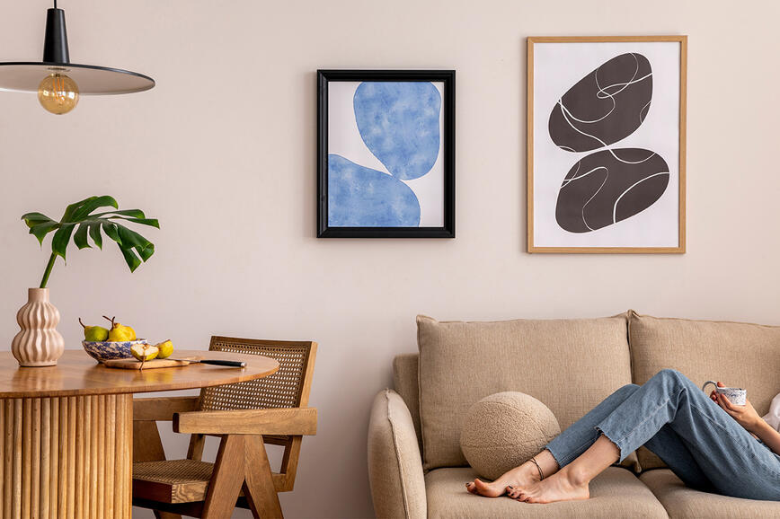
Con le tonalità neutre della terra non potrai di certo sbagliare, dato che offrono una sensazione di calore e di legame con la natura. Quando si decide la scelta dei colori nelle proporzioni suggerite, è importante tenere presente che le tonalità più chiare donano un aspetto più ampio allo spazio, mentre quelle più scure lo fanno sembrare più piccolo, ma creano anche una sensazione di domesticità e intimità. Lo spazio mostrato nell’esempio è naturalmente luminoso e caldo, pertanto abbiamo scelto la tonalità morbida e sabbiosa N05-2 come colore principale per le pareti. Il colore secondario è rappresentato dalle tonalità di marrone come N03-7 e dai mobili in legno naturale. La scelta dello stile dei mobili dipende da te e dalle tue preferenze. Per una casa vacanze al mare è possibile scegliere uno stile moderno e minimalista, lo stile scandinavo o un arredamento rustico rinnovato. Consigliamo di non mescolare gli stili, perché il tema dello spazio andrebbe perduto e gli spazi più esigui darebbero un aspetto ancora più caotico. Naturalmente, si possono prevedere leggere variazioni se si vuole sottolineare la propria personalità con un pezzo particolare. Il colore d'accento dello spazio è il blu pastello, che ricorda il mare e il cielo soleggiato. Le tonalità di blu vengono introdotte nello spazio con cuscini per divani, copriletto, tende, o anche con la tavola della sala da pranzo, i coperti o i quadri. Non dimenticare la scelta i materiali giusti, come il tappeto in rattan e il vaso di argilla sul tavolino da caffè, nonché i motivi dei cuscini e delle tende. La scelta del materiale è molto importante quando si tratta di tende e si può scegliere tra materiali leggeri come il lino o pesanti tende jacquard. Anche i reperti della spiaggia, delle conchiglie o i sassolini nei vasetti delle candele, un vecchio, ma esclusivo, cappello di paglia o un ventaglio comprato come souvernir in un viaggio lontano possono dare un tocco accogliente e naturale.


Un tocco marino e fiori profumati
L'azzurro del mare e i fiori rosa nella loro fase di fioritura con spiagge sabbiose sono una delle combinazioni di mare più attraenti che portano più vivacità e contrasti di colore in uno spazio. Abbiamo scelto una combinazione di colori più forte perché lo spazio era già abbastanza luminoso in partenza. Per il colore principale abbiamo scelto la tonalità blu B03-5, che rinfresca l'ambiente sul piano visivo e si adatta particolarmente bene alle case vacanze in riva al mare. Più scura è la tonalità di blu scelta, maggiore sarà l'intimità e il sapore di casa della stanza. Il colore secondario è rappresentato dalle tonalità tenui di sabbia e beige come N02-4, che si riflettono nella scelta di mobili in legno chiaro e di un divano a tre posti imbottito color crema. Scegli solo i mobili di cui hai veramente bisogno, perché le case vacanze di piccole dimensioni possono diventare ben presto troppo ingombranti. E come ciliegina sulla torta, aggiungi accessori a contrasto, come cuscini per divani e fioriere nelle tonalità rosa. Un'attenzione particolare va riservata anche alla combinazione di texture diverse per rendere lo spazio più dinamico. Di certo non possiamo dimenticare i tocchi personali che creano un'atmosfera accogliente e nautica, come un ventaglio naturale e una ciotola in rattan nel nostro caso.


Un'oasi naturale con un tocco di stravaganza
Una dinamica combinazione naturale di verde e blu, arricchita da accenti dorati, trasforma lo spazio in un'oasi boschiva e aggiunge un tocco di stravaganza. Come colore principale dello spazio, il verde scuro G12-7 crea la sensazione di ritrovarsi in un bosco fresco dopo una tempesta. Le tonalità di verde scuro possono essere splendidamente accentuate da dettagli dorati, che si evincono nella scelta dei mobili, del lampadario e dei pavimenti in parquet naturale di una tonalità calda. I mobili scelti appaiono raffinati e moderni, mentre gli accessori in blu scuro enfatizzano il contrasto e conferiscono un aspetto di leggera freddezza. La tonalità fredda del blu può essere mitigata dalla scelta dei materiali: il velluto della seduta è morbido e caldo e il tappeto ha la stessa sensazione. In questa combinazione, il colore dorato non è solo desiderabile ma essenziale, aggiungendo calore e un senso di lusso.


Colore solare con un accenno di mare
La vivace combinazione dei colori giallo e blu porta calore e freschezza nello spazio, poiché entrambi i colori evocano il cielo e il sole. Le pareti bianche donano freschezza, mentre il divano e il pavimento in grigio chiaro mostrano un effetto neturale e fresco. Il design di base degli interni, in una combinazione di bianco e grigio, crea una tela neutra che consente un gioco di tonalità più vivace. In questo caso, i colori secondari e quelli d'accento sono in proporzione simile. Il giallo è stato introdotto nello spazio con un copriletto, delle sedie da pranzo ed elementi decorativi. Il tappeto blu fa da contraltare al giallo, così come il pannello decorativo che integra bene lo stile personale di chi lo possiede. La base neutra offre numerose possibilità di abbinamento con le tonalità blu e giallo. Che si tratti di un lampadario, di un set da pranzo, di quadri o di frontali di elementi per la cucina, aggiungeranno un carattere più personale e una maggiore vivacità allo spazio.
Non vanno inoltre dimenticati gli accessori che possono dare un senso di familiarità e riflettere le tue esperienze personali, come una ciotola del tuo viaggio in Marocco o un pesce decorativo realizzato con del legname. Utilizza gli accessori con parsimonia, in quanto lo spazio può diventare rapidamente sovraffollato e creare una sensazione di caos. Come si suol dire, meno è di più: scegli solo i pezzi che hanno un significato speciale per te e che si inseriscono armoniosamente nell'ambiente generale.


Tendenze colore 2025: un raffinato equilibrio tra toni naturali e toni ricchi e intensi
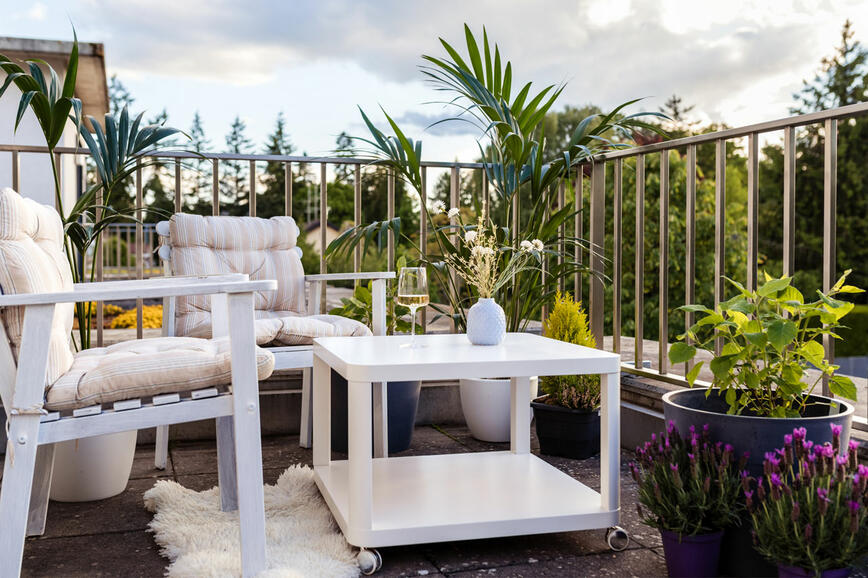
Rinnova il tuo balcone o terrazzo: crea un incantevole angolo esterno per goderti la natura
Come ingrandire visivamente un piccolo ambiente?
Il segreto di una casa meravigliosamente decorata sta nei dettagli
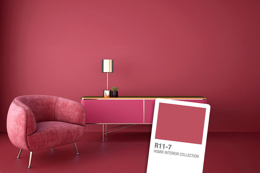
Rosso rosato vivace: il colore audace e ottimistico dell’anno
Come donare alle pareti un look usurato
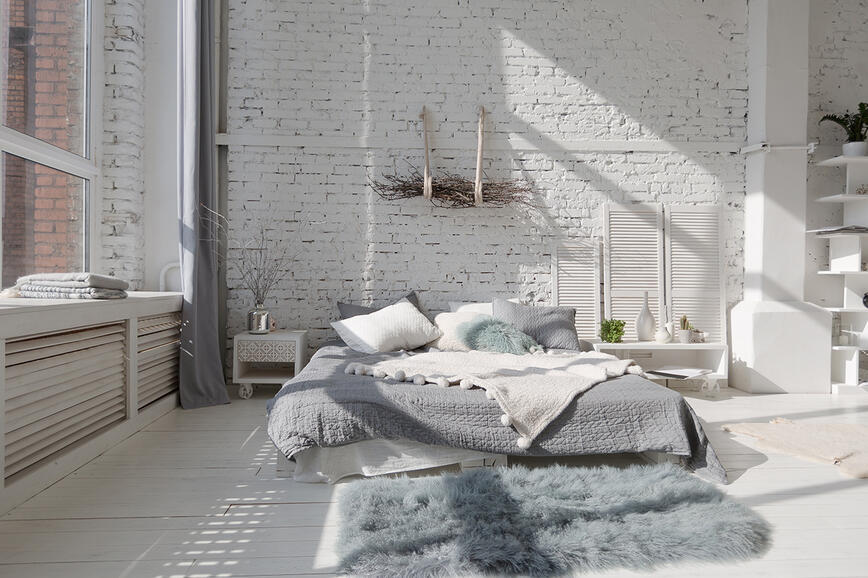
Perché il bianco è così amato?
Il nero – il re dei colori
Idee creative per decorare la stanza dei bambini
I colori pastello in casa per evocare la primavera
Colour blocking – una moda che spinge i limiti