Secretul unei case frumos decorate stă în detalii
Planificarea și decorarea casei nu este doar despre alegerea culorilor și a mobilei, ci despre combinarea diferitelor palete de culori, materialelor, texturilor și nuanțelor, ținând în același timp cont de interesele, hobby-urile, amintirile și experiențele noastre care conferă interiorului o notă personală. Nu este suficient doar să selectăm o noptieră drăguță; este despre a combina metalul rece al noptierei, lumina caldă emanată de bec, cartea așezată pe noptieră, mesajul printului atârnat deasupra patului și paleta de culori jucăușe ale lenjeriei de pat. O singură piesă de mobilier, oricât de uluitoare este, nu este niciodată îndeajuns pentru a atinge potențialul maxim al camerei - secretul unei case frumos decorate stă în detalii.

Cum să decorezi o casă și de unde să începi? Începeți cu obiectele care sunt deja acolo. Fiecare obiect, care este pus într-o încăpere într-un anumit fel, poate funcționa ca element decorativ, fie că este o pătură moale, un bol cu lămâi sau un suvenir din ultima călătorie. Decorarea casei nu ar trebuie să fie la întâmplare; alegeți cu grijă elementele care vor scoate în evidență rafturile, blatul sau masa unde mâncați și, uneori, puneți-le deoparte și reașezați-le. Decorarea locuinței dumneavoastră este o călătorie pe termen lung - casa dumneavoastră ar trebui să evolueze gradual, împreună cu dumneavoastră, interesele și stilul dumneavoastră de viață.
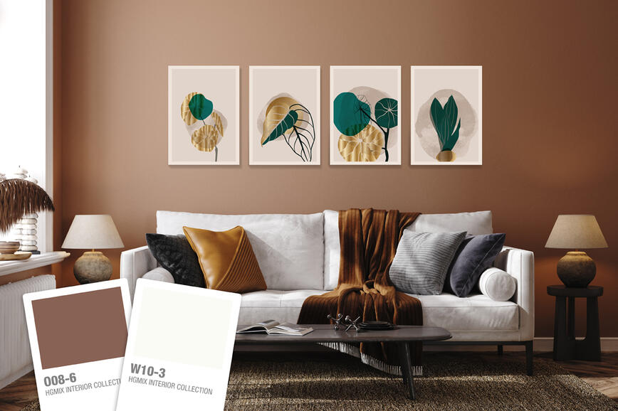
O senzație de lux împreună cu tonurile aurii și de maro calde


Fiind o culoare caldă, auriul merge foarte frumos cu alte tonuri calde, precum tonuri de maro și bej deschis, care vor crea senzația de confort, eleganță și strălucire. O modalitate sofisticată de a introduce auriul într-o încăpere este de a folosi SPEKTRA Decor Topaz vopsea decorativă cu reflexie metalică. O altă idee bună ar fi să alegeți cu atenție elemente decorative care includ detalii cu finisaj auriu sau de alamă, precum fotografii și oglinzi cu rame vechi sau sfeșnice. Și nici nu e greu să înlocuiești mânerele de la dulapurile de bucătărie, sertare sau uși. Cu toate acestea, evitați combinațiile cu metale care au finisaje argintii, pentru că vor răci căldura dată de auriu. Senzația de confort poate fi creată și cu ajutorul unui număr mare de perne decorative, mulaje decorative sau o carpetă mare cu aspect luxos, pentru că experții bagă mâna în foc pentru lenjeriile de pat monocolore. Una dintre cele mai frecvente greșeli în designul interior care ar trebui menționată este alegerea unei carpete mici care face ca încăperea să fie și mai mică. O carpetă trebuie să fie suficient de mare încât să includă în mod confortabil toate elementele de mobilier care sunt așezate pe aceasta, și ar trebui să ajungă cel puțin la picioarele din față ale canapelei, fotoliului și a altor elemente din jurul mesei. În mod similar, draperiile nu ar trebui să fie prea scurte, deoarece scopul este acela de a crea iluzia de ferestre mari și tavane înalte. Draperiile ar trebui să atingă podeaua, iar pentru un efect bogat și voluptuos, pot fi mai lungi cu aproximativ un centimetru, dar nu ar trebui să se oprească niciodată la mai mult de 2 cm deasupra podelei.
O combinație de verde și materiale naturale – o odă naturii pure


Tonurile bogate de verde care evocă natura pură și o pădure deasă au puterea de a transmite unei încăperi energie proaspătă și senzația de a trăi în sânul naturii. Tonurile bogate de verde se potrivesc mai bine în combinație cu alte culori și materiale pe care le găsim în natură, mai degrabă decât într-un interior minimalist, putând obține un număr mai mare de elemente decorative. Tonurile bogate de verde pot fi combinate cu tonuri de maro, mai ales cu lemnul de culoare deschisă, tonurile de pământ, precum și cu albul șters, nuanțele de gri deschis sau roz prăfuit. Tonurile de verde completează perfect suprafețele din lemn și alte materiale naturale. Dacă aveți o pardoseală din lemn fin, permiteți-i să își arate strălucirea în toată splendoarea sa naturală și evitați covorul sau alegeți un covor realizat din materiale naturale, precum lâna, sisalul, nuca de cocos sau fibrele de celuloză. De asemenea, căldura lemnului se potrivește foarte bine cu suprafețele din piatră, marmură sau ceramică, care poate fi introdus în încăpere cu ajutorul elementelor decorative, precum vase de lut ornamentale, vaze sau boluri. Un șiretlic simplu este să folosiți vase de lut ornamentale cu lămâi, lămâi verzi, kiwi sau alte fructe de sezon. Un alt mod inteligent de a introduce cu grijă un număr mare de elemente decorative într-o încăpere este cu tăvi, care definesc vizual spațiile pe care doriți să le decorați. Combinați elemente de diferite dimensiuni, cu diferite texturi, culori, finisaje mate sau lucioase, și urmați regula celor trei. Un grup de trei elemente, de exemplu trei vaze de înălțimi diferite, diferite culori sau texturi, vor da un efect vizual organic mai pronunțat decât un singur obiect sau o pereche de două articole. Pentru a spori senzația de profunzime, puteți include și țesături în nuanțe de alb șters care vor domoli paleta de culori de verde închis. Înlocuiți draperiile din catifea grea cu un material ușor și culori deschise și contururile ascuțite cu forme blânzi, organice.
Griul mereu clasic și modern armonizat cu tonuri de culori blânde


Nuanțele blânde de mov se potrivesc perfect cu tonurile clasice atemporale, precum cele de gri, antracit, alb șters sau bej, dar poate fi o provocare să le combinați cu culorile strălucitoare sau intense. Blândețea și gingășia movului pal poate fi scos în evidență cu țesături de casă moi precum perne decorative, pleduri, carpete, pufuri tapițate, acestea completând mobila sau finisajele deschise la culoare, albe cu efect de piatră, cum ar fi marmura, ceramica sau sticla gri. O carpetă mare este, de asemenea, o alegere bună pentru încăperile cu podea din lemn masiv și o nuanță de galben vizibilă; este posibil să nu se potrivească cu nuanțele blânde și ușor reci ale tonurilor de mov cenușiu. De asemenea, gândiți-vă cu atenție atunci când alegeți plantele, care pot părea ca agresive dacă le combinați cu liliacul blând. Interioarele cu o paletă de culori monotonă pot fi revitalizate combinând diferite texturi, stiluri și materiale sau câteva nuanțe de culoare. Un principiu asemănător se aplică atunci când potriviți mobila existentă. Atunci când selectați culorile pereților, scopul nu este de a copia mobila, ci de a găsi combinații de culori care se completează reciproc, chiar dacă tonurile sunt foarte asemănătoare. Pentru a crea contraste într-o încăpere, accentele de negru pot fi introduse cu fotografii, printuri sau vaze alb-negru. Evitați, însă, elementele de mici dimensiuni, care vor face ca încăperea să pară mai mică. Acest principiu se aplică în același mod și fotografiilor; acestea nu ar trebui să fie prea mici, deoarece ar face ca spațiul să pară gol. O fotografie ar trebui să aibă o lățime de cel puțin două treimi din cea a mobilei deasupra căreia este agățată. Alternativ, puteți dispune mai multe fotografii mici într-o galerie mare. O regulă generală asemănătoare ar trebui respectată și când alegeți o măsuță de cafea, care ar trebui să aibă cel puțin jumătate din înălțimea canapelei. Când alegeți mobila, gândiți-vă nu numai la aspectul său, ci și la locul unde o poziționați în încăpere.
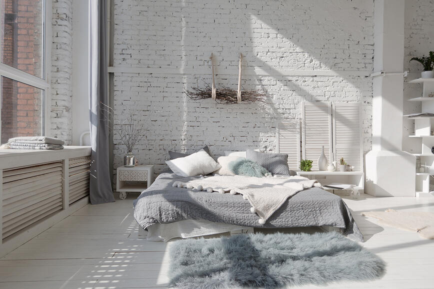
Tonurile neutre - seninătate și minimalism pe care doar scandinavii și japonezii le cunosc


Abordarea minimalistă a stilurilor scandinav și japonez constă dintr-o paletă de culori de tonuri neutre, precum tonurile de maro deschis și nisipiu, taupe sau gri deschis, combinate cu materiale naturale. Aspectul simplu dar impecabil poate fi obținut și cu articole realizate din ratan, coșuri de răchită, carpete din iută, covoare țesute sau covoare realizate din fibre naturale, precum și lenjerii de pat bumbac și in. Când ne dorim o idee minimalistă, recomandarea cea mai bună este de a limita numărul de elemente decorative. Selectați mai puține elemente de un stil simplu, cu contururi curate, realizate din materiale naturale și practice, cum ar fi pături, produse de olărie realizate manual, postamente de piatră sau cărți. Cărțile sunt, desigur, indispensabile. Camera ar trebui să dea o senzație de deschis și aerisit. Mutați modulul sau canapeaua la o distanță de cel puțin 5-10 cm de perete și nu uitați să lăsați spații goale mari acolo unde privirea se oprește. Alegeți cu grijă fotografiile și printurile, să fie în acord cu stilul minimalist, deoarece nu doriți ca prezența lor să pară agresivă. Acestea fiind spuse, minimalismul nu este deloc plictisitor. Vitalitatea și profunzimea pot fi adăugate într-o încăpere prin combinarea diferitelor texturi, de exemplu tehnica de decorare recentă și foarte populară de a crea texturi cu un compus de nivelare pentru perete decorativ cu aspect deteriorat, sau introducând accente de culori ale tonurilor de verde sau teracota maro-roșiatică. Este de luat în considerare și culoarea tavanului. Pentru un aspect integrat și finisat, alegeți o culoare cu câteva tonuri mai deschise decât culoarea pereților. Prin combinarea elementelor de design japonez și scandinav, puteți crea un spațiu care este aerisit, simplu dar desăvârșit din punct de vedere vizual.
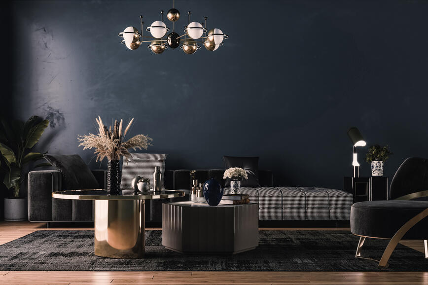
Negrul, un clasic etern și sinonim pentru strălucire


Deși puternic contrastantă, o combinație de alb-negru conferă adesea un efectul unidimensional în spațiile interioare. Ar fi mai bine să înlocuiți negrul cu antracit sau cu un gri foarte închis și îl combinați cu nuanțe de alb șters sau foarte deschis, mai degrabă decât cu un alb pur. Această combinație poate fi combinată cu alte tonuri mai intense, dar culoarea lor ar trebui limitată. Este mai bine să extindeți această paletă cu diferite tonuri ale unei singure culori. O combinație de alb-negru sau aproape alb-negru se potrivește foarte bine cu tonurile de albastru, verde mentă sau roz pal. Într-o cameră dominată de culoarea neagră, senzația de lumină bună are o importanță esențială. În plus față de sursa principală de lumină, puteți aduce un plus de lumină atmosferică cu ajutorul lămpilor de podea sau de masă, care au și un rol ornamental în cameră. Oglinzile sunt mereu un element popular, mai ales în camerele mici ori care conțin culori închise, deoarece acestea conferă senzația de spațiu mai amplu și ajută să răspândească lumina. O paletă contrastantă de culori închise și deschise oferă o puzderie de posibilități pentru combinații cu elemente decorative, cum ar fi fotografiile alb-negru, printurile, statuile, vazele, de la artă avangardistă la un aspect renascentist clasic. Dacă rafturile, masa sau blatul sunt în culori deschise, selectați elemente decorative mai închise, pentru a le pune în valoare, și invers. Albul și negrul ar trebui să alterneze într-o încăpere și să dea întotdeauna un echilibru.
Învăluit de culorile reminiscente ale mării


Atunci când combinați culoarea albastră, puteți respecta o paletă de culori reci care creează un efect însuflețit și puteți să o potriviți cu tonurile de alb, gri deschis sau bleu. Alternativ, puteți selecta o combinație de culori care au un subton specific cald, cum ar fi ocru, maro deschis, precum și tonurile de alb crem. Atunci când alegeți o paletă de culori se recomandă să luați în considerare piese de mobilier mari și alte elemente existente din cameră, cum ar fi podeaua - dacă are un subton de galben pronunțat sau cald, sfatul nostru este să combinați albastrul cu alte tonuri calde. În timp ce tonurile calde merg cel mai bine cu lemnul în culori deschise și cu piesele de mobilier în culori neutre, tonurile reci se potrivesc bine cu eternul alb - pereți albi, mobilier alb sau, chiar mai bine, mobilă albă cu un aspect de deteriorat, pentru a evoca amintiri de la mare, un blat de piatră sau marmură și mobilier de culoare gri. Albastrul este cu siguranță o culoare versatilă care poate crea efecte foarte diferite atunci când este combinată cu atenție. O paletă de culori dinamică poate fi obținută și prin selectarea diferitelor tonuri de albastru pentru elementele decorative precum perne decorative, cuverturi sau carpete, putând fi combinate foarte frumos cu diferite modele. Aveți grijă la carpetele cu model puternic și la mesele din sticlă; în aceste cazuri, decorarea mesei ar trebui să fie simplă, poate doar cu o vază cu flori proaspete sau o plantă în ghiveci. Dacă ați vrea să readuceți atmosfera de la mare într-o încăpere și să decorați rafturile cu suveniruri pentru a vă aminti de mare tot timpul anului, aveți grijă să nu vă lăsați duși de val. Este mai bine să alegeți mai puține articole și să le aranjați cu grijă. Puteți adăuga elementele decorative de-a lungul anului, dar respectați următoarea regulă: pentru fiecare articol nou pe care îl adăugați pe raft, un altul trebuie scos. O soluție mereu la îndemână, mai ales pentru rafturile deschise unde diverse mărunțișuri tind să se înmulțească, este folosirea unor cutii decorative. Din când în când se recomandă să luați tot de pe rafturi și să le rearanjați de la zero. Poate o nouă poziționare a elementelor decorative vă vor arăta o nouă latură a lor.
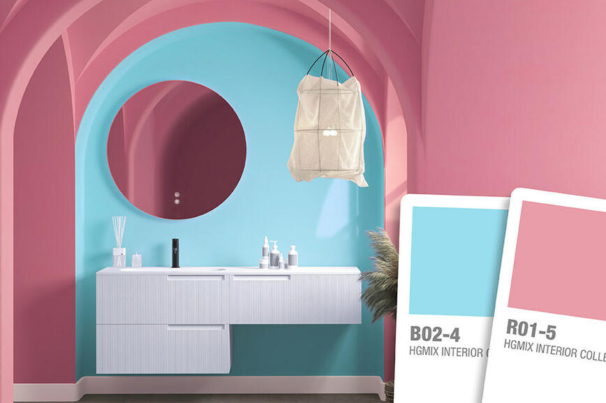
Tonurile de albastru și coral în combinație cu negrul


Ca regulă generală adesea scoasă în evidență în designul interior, punctul de plecare pentru decorarea casei ar trebui să fie alegerea unei culori neutre, care este apoi completată de detalii minore în culori mai intense și mai puternice. Poate că ordinea poate fi inversată selectând combinații de culori îndrăznețe și curajoase, precum roșu coral și albastrul aprins ca punct de plecare, apoi creând un echilibru cu elemente decorative în tonuri neutre - negru, alb sau gri. Atunci când folosiți tonuri de culori intense, nu se mai aplică multe din regulile de design interior, dar, în același timp, deschid calea unor noi posibilități de un aspect modern, diferit și neașteptat. Dacă rafturile albe pe pereții albi tind să se integreze pe fundal, culoarea intensă a peretelui va tempera rafturile, ca un detaliu interesant care sigur va capta privirea din cauza contrastului puternic. Folosiți cu grijă oglinzile; ar trebui introduse în cameră cu precauție, deoarece dublarea suprafețelor, în mod neinspirat, cu o culoare intensă poate domina rapid și strica echilibrul din cameră. Culorile intense pot fi combinate într-un mod interesant cu ajutorul tehnicii denumite blocarea culorilor, care vă permite să adăugați atâta culoare cât este necesar, fără să fiți limitați de planul pardoselii din cameră. O cameră unde culorile intense predomină poate fi temperată, dacă este necesar, cu un tavan alb sau o carpetă deschisă la culoare, de un alb șters, pentru relaxarea ochilor. Dacă stilul dumneavoastră de viață vă permite, aspectul modern al combinațiilor de culori intense și interesante se potrivesc foarte bine și cu mobila albă, cum ar fi fotoliile sau modulele albe. Puteți obține și un aspect colorat intens și oarecum neobișnuit dacă selectați corpuri de iluminat sau lumini pentru tavan, deoarece acestea trec de raza vizuală și vă conferă mai mult spațiu pentru a experimenta. Nu este nevoie să vă feriți de combinațiile de culori intense, sălbatice ori dintre cele mai neobișnuite.
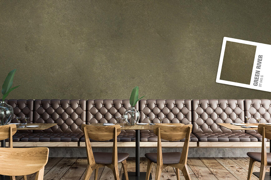
Spații rafinate cu caracter: tehnici decorative SPEKTRA Decor Topaz și Quarz pentru interioare contemporane
Tendințe de culori 2025: Un echilibru sofisticat între tonuri naturale și bogate, intense
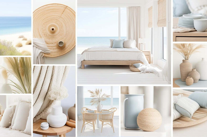
Nuanțele verii în casele de vacanță
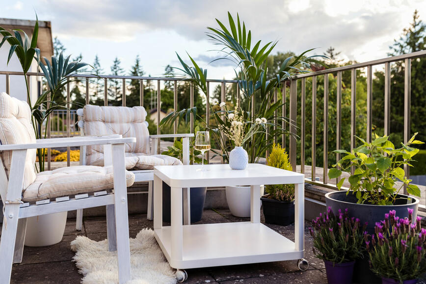
Renovarea balconului sau a terasei - creați un colț fermecător în aer liber pentru a vă bucura de natură
Cum să mărești vizual un spațiu mic?
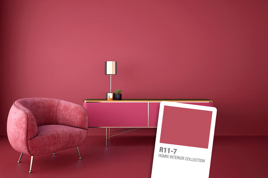
Roșu trandafiriu vibrant: culoarea îndrăzneață și optimistă a anului
Cum să dați pereților dvs. un aspect de vechi
De ce este albul atât de preferat?
Negrul – regele culorilor
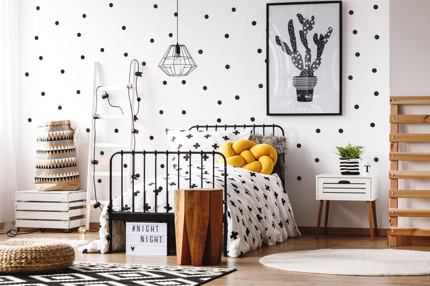
Idei creative pentru decorarea camerei copiilor
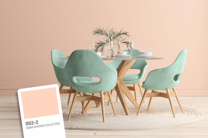
Culori pastelate în casă pentru a evoca primăvara