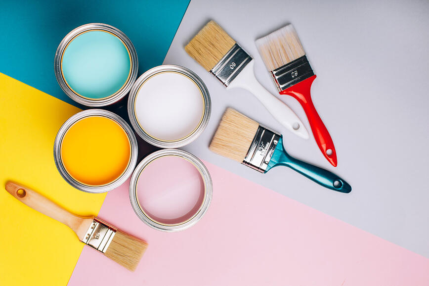
Bold colours or soft elegance: How to paint a space with personality
In interior design, it is often said that light shades give a space an airy, open feel. But if you like colours with character, you might be tempted to go the bolder route – with intense, rich colours that bring depth, character and sophistication to your home. When you think of bold colours, you most often imagine vibrant and strong tones, but their scope is much wider than that. There are also subtle bold shades – those that combine the power of expression with a sense of calm, elegance and warmth. With the right choice, you can create a space that is not only noticeable, but also inviting and comfortable.

Why choose bold colours?
Before we get into practical tips, let's first answer a question that many people ask: why choose more intense colours in the first place? Light shades are a safe choice – they seemingly enlarge the space, add a feeling of airiness and go with almost everything. But sometimes you might want more character, contrast or warmth. Here is where bold colours come in, offering completely different benefits. Their power is not only in their appearance, but also in how you experience the space.


Elegance and character: Intense tones such as deep blue, emerald green or velvety burgundy red add depth and character to a room that is hard to achieve with lighter colours. They act as a background to highlight furniture, artwork or decorative elements, while creating a clear visual direction for the room. They can appear sophisticated or dramatic – depending on how you use them and what you combine them with.
Comfort and an intimate atmosphere: Darker tones help reduce the feeling of emptiness in large spaces and they make smaller spaces warmer and more welcoming. They can be calming in the bedroom and create a relaxed and comfortable atmosphere in the living room. They appear softer than many people imagine – especially when combined with natural materials, textiles or soft lighting.
They highlight the special features of the space: If you have a fireplace, a wall with a niche or an interesting architectural detail, a bold colour can make it stand out. A single shade in the right place can be enough to give a space a whole new dynamic.


What should you pay attention to when choosing intense colours?
When considering more intense colours, don't just let the inspiration of the moment guide you, but also consider the characteristics of your space. When choosing a bold colour, consider the following factors:
Natural light: Light has a strong effect on how colours appear in a space. In spaces with a lot of natural light, bold shades look rich, warm and vibrant. But in spaces with less light, they can quickly create a feeling of heaviness or confinement. We recommend that you test your shade at different times of the day to get a realistic idea of how it will perform in practice.
Size and function of the room: In larger spaces, you can afford to be more bold – deep colours will add character without adding a cramped feeling. Smaller spaces and those with lower ceilings require more attention. If you use dark colours, balance them with light furniture, mirrors or open shelving to add airiness. Consider the function of the room – for example, a bedroom can tolerate softer tones than a work area.
Personal style: A bold colour should not just be a fashion choice, but a reflection of your character. Fans of classic interiors often opt for dark blue shades, as they look calm and elegant. Emerald green or burgundy red tones are also common choices, while the more adventurous go for mustard yellow and purple, slightly eclectic shades. Whatever colour shade you choose, it's essential to make the room feel relaxed and homely.


How to incorporate bold colours in a fresh and original way?
Bold shades aren't just reserved for living room walls. There are many clever ways of integrating them into a space – without overdoing it and even where you wouldn't expect them.
Colour blocking – a trend that pushes boundaries: Colour blocking is a technique that combines two or more strong colours in a single space in clearly separated, geometrically defined areas. Although it comes from the fashion world, it has been very popular in interior design for some time – precisely because of its ability to create maximum impact with minimum intervention.


Try painting one wall in two bands of colour, creating a big colour circle behind the sofa or using a diagonal line to break up the monotony of the room. For a more subdued effect, choose a combination of a bold and neutral shade, or two contrasting colours for a more vibrant look. The effect will be even stronger if the colours are repeated on furniture or selected accessories.
Bold colours in transitional spaces: A deep red, dark green or purple in the hallway can create a strong impression from the moment you enter, suggesting a style that is subtly continued in the rest of the home. If the spaces are connected, consider a colour thread – for example: the tone of the hallway can be repeated on the decorative cushions in the living room. Even doors, ceilings or internal window frames in a bold shade can create a surprisingly powerful effect.
The ceiling as the fifth wall: The ceiling is often neglected, but in reality, it is the perfect canvas for bolder colours. It's a surface that is less visible, but that's why colour can create subtle surprises and add depth and character to a space.
In spaces with light walls, you can opt for a contrasting shade on the ceiling – this will create the feeling of a lower, more intimate space. In spaces with higher ceilings, a rich shade on the ceiling visually balances the space. At the same time, a darker ceiling also lowers a too-high space and makes it more pleasant to reside in.
You can also paint the ceiling in a child's room, above the dining table or in a home office – and complement it with an interesting lamp, coloured furniture or artwork on the wall. For a more restrained but still effective result, paint the ceiling the same shade as the walls, but a slightly lighter version. This will create a sense of integrity without a sharp colour break.
Tips for painting with bold colours
Once you have chosen your colour, you have already taken the most important step. Now all that's left is the execution – and don't worry, intense colours are no more difficult if you follow a few simple tricks.
Testing the colour in the space: Before you decide on a bold colour for the whole space, test it in different light and at different times of the day. This way you can observe the colour in natural light, under artificial lighting and even in the evening when the room is illuminated only by lights. This will help you assess whether the colour really matches your room – before you start the full application.


Colour gloss and finished look: In addition to the shade, the gloss level also plays an important role. Matt finishes are popular for dramatic colours as they reduce light reflection and look soft, elegant and modern. But if you want to add more depth to a room, consider a satin or semi-gloss finish – especially in smaller spaces, where the reflection adds to the feeling of spaciousness. Please consider that glossier coatings can emphasize imperfections on the walls, so preparation is particularly important: the wall must be smooth, well cleaned and properly smoothed.
Preparation is key: Proper preparation is essential when painting with bold colours to ensure a smooth, flawless finish. Start by cleaning and preparing the walls, filling any cracks or holes and sanding rough surfaces. Coat the walls with the SPEKTRA Extra good quality white paint to create a smooth, even surface to which the paint will adhere. It is very important to apply intense shades on a uniform surface.
Wall protection: When painting walls in intense tones, the use of painter's tape is essential. The tape is installed in one piece to achieve a neat and straight line of contact between the painted wall. It is best to remove the tape when the paint is still wet to prevent some of the paint from peeling off. When using bold shades, it is very important to apply the paint with a roller from the ground up to the top so that the application is not interrupted, and not with a brush.
Application technique: When applying an intense shade to a wall, the paint needs to be applied in an even, thin layer so that the colour looks even and uniform on the wall.
Dare to be bold!
Painting in bold, dramatic shades is a brave design decision, but one that – with a little planning and a lot of creativity – can more than pay off. Whether you want to create elegance, warmth or a hint of mystery, colours with character offer endless possibilities for expression.
Now that you know all the steps – from choosing the perfect shade to thoughtful implementation – it's time to give your home a fresh look that won't go unnoticed.

Radiator Renovation: From preparation to finish
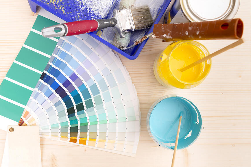
Why is it wise to test paint before buying it?
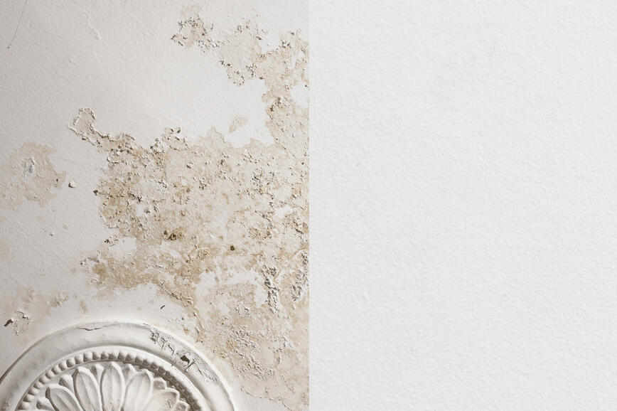
How to effectively block water-soluble stains on wall surfaces
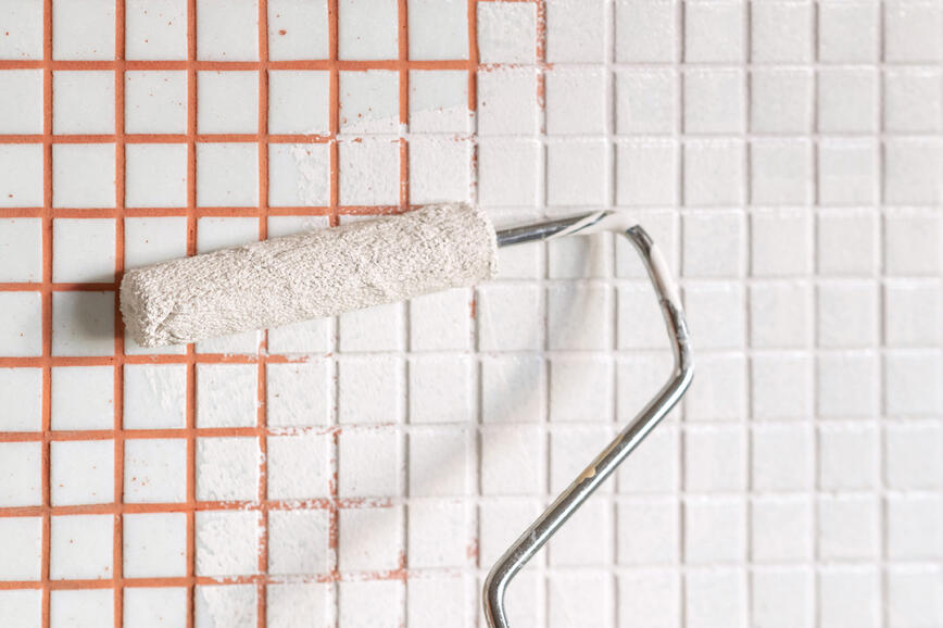
Renovating your bathroom in one step with ceramic tile paint
Painting project: From preparation to cleaning
Renovation of a façade due to the growth of mould and algae

A project for autumn - restoring an outdoor metal fence

How to properly and safely get rid of paint residue?
Choosing a facade paint that does not fade over time
Facade choice - differences in thermal insulation
Façade energy renovation